42 Survey Experiments: Vignettes, Conjoint, and List Experiments
This chapter is part of a book in active development and has not yet been through the author’s review. Content may change as the review advances.

The research decision. Decide what you randomize inside your questionnaire, and whether the number it yields describes something people already hold (a prevalence, a preference) or tests the effect of a message you wrote. Then say what a stated answer can and cannot tell you about what people actually do. The questionnaire is yours, so no tool gets to decide what its numbers mean.
42.1 Why this decision matters
The decision on the table: what your survey experiment measures, and how far a stated answer can travel toward real behaviour.
“Your survey says four percent of staff have pasted client files into an unapproved AI tool. I have seen the network logs. Either your number is wrong, or you asked a question nobody would answer honestly. Tell me which, and tell me what your next number would mean.” — a chief information-security officer, reading an internal staff survey at an accounting firm
People do not always tell a survey the truth, and they often do not know it. Ask an employee straight out whether they broke the data policy, and many who did will say no. Ask a job seeker which matters more, salary or remote work, and you get an opinion about themselves rather than a record of the choices they make. A survey experiment answers both problems with the same move: you let chance decide which version of a question each respondent sees, and you read the answer off the difference between versions. That move does real work, and it is easy to misread. Randomizing inside a questionnaire does not make every number causal, and it does not turn a hypothetical choice into a real one. This chapter gives you the decision that keeps those two confusions out of your write-up.
42.2 The concept
Survey experiments live on two of the book’s pathways at once, and your stated question decides which one you are on. The coin flip does not. When the question asks about something respondents already hold, a prevalence or a preference, you are on the experimental-descriptive pathway. RDSS files both list and conjoint experiments in its experimental-descriptive design library for that reason: the experiment works as a measurement instrument (Blair et al. 2023). When the question asks what a message you wrote does to answers, you are on the experimental-causal pathway, with the same coin flip and a causal inquiry.
A survey experiment is a questionnaire in which chance decides which version of some question, text, or item each respondent receives (Mutz 2011). Example: half of a representative sample reads a news paragraph that frames a tax as “a fee on polluters,” the other half reads “a tax on energy,” and both then report their support. Three families cover most of what you will meet.
A framing experiment is a survey experiment that randomizes the wording or content of a message and measures its effect on a stated attitude. Example: a political scientist tests whether naming a policy’s cost changes support for it. The estimand is causal: the average difference in stated support that reading one version rather than the other produces, among these respondents, in this survey. It says nothing yet about a ballot cast months later.
A vignette experiment is a survey experiment in which respondents judge a short described scenario whose features are randomized, one feature or several at once. When several features vary together it is often called a factorial survey. Example: a conservation biologist describes a wetland restoration plan and randomizes which species it protects and what it costs each household, then asks whether the respondent would support it (Auspurg and Hinz 2015).
A conjoint experiment is a vignette design pushed further: respondents compare whole profiles, such as two job offers or two candidates, each built from several attributes whose levels are all assigned at random. Example: an offer with a 10 percent raise, two remote days, and AI tools allowed, set beside an offer with no raise, five remote days, and AI tools banned. The average marginal component effect (AMCE) is the average change in the chance that a profile is chosen when one attribute moves from its baseline level to another level, averaged over all the other attributes as you randomized them, and over the offers it was paired against (Hainmueller et al. 2014). Example: an AMCE of 9 points for “five remote days” means that switching an offer from no remote days to five raised its chance of being chosen by 9 percentage points, on average across the salaries, policies, and rival offers it came bundled with.
That last clause is where conjoint results go wrong. The AMCE depends on the distribution of attributes you chose to show. RDSS calls the inquiry data-strategy-dependent, because the average is taken over a mix of profiles that you, the researcher, set (Blair et al. 2023). Two consequences follow. First, AMCEs for different attributes are not a ranking of what people care about, because each depends on how far apart you set its levels. A salary range that tops out at +20 percent will look more important than one that tops out at +10 percent, with identical respondents. Second, comparing AMCEs between subgroups, such as older and younger job seekers, can mislead: the comparison depends on which level you named as the baseline, so describe each subgroup with marginal means, the plain share of profiles chosen when they carry a given level (Leeper et al. 2020).
Hainmueller and his coauthors define the AMCE as a causal effect of a feature on a stated choice. RDSS frames the conjoint inquiry as a description of preferences, since you could in principle ask about every possible profile and the experiment only samples them, and it grants that the causal reading is also correct (Blair et al. 2023). The number is the same either way, so the compass reads your question, not the estimator. “Which offers do these job seekers say they prefer?” is descriptive. “What does describing an offer as fully remote do to the chance these job seekers pick it?” is causal, and the kind rule keeps it causal: the effect of a feature of a hypothetical profile on a stated choice, under the mix of profiles you dealt. Neither version reaches what anyone does with a real offer.
A list experiment is a survey experiment for sensitive behaviour. Every respondent sees a list of innocuous statements and reports only how many are true for them, never which. A random half sees the same list plus the sensitive item. Example: four control statements about commuting and meetings, plus, for the treatment half, “I pasted client information into an AI tool the firm has not approved.” Because the two halves are alike on average, the difference in their mean counts estimates the share who hold the sensitive trait, the prevalence (Blair and Imai 2012). A count in the middle of the range cannot pin the trait on the person who gave it, since the control items could explain it, which is the point. A count at either end can: in the longer list, a total that the control items alone could never reach announces the trait. The protection is only as good as the list.
Two assumptions carry the list experiment, and RDSS names them plainly. No design effects means adding the sensitive item does not change how people count the control items. No liars means people who hold the trait do add it to their count (Blair et al. 2023). A ceiling effect breaks the second: someone who agrees with every control item and holds the trait would have to report the maximum, which is a confession, so they shave one off. A floor effect is the mirror image near zero: when the control items are so rare that almost everyone’s honest control count is zero, a count of one reads as an admission, so some people who hold the trait report zero instead (Blair and Imai 2012). Control items chosen so that almost nobody lands at either end keep both at bay, and pairing items that tend to cancel out also shrinks the noise (Glynn 2013).
Whatever the family, the warrant has two parts. Random assignment of versions licenses the comparison between them. Only the sampling licenses reach: a probability sample of the firm’s staff lets a prevalence speak for the staff, while an opt-in panel leaves it with the people who answered.
42.3 A worked example
Take the security officer’s challenge seriously. You run a staff survey at a mid-sized accounting firm, and the policy question is how many employees pasted client information into an unapproved AI tool last month. A direct question produced the four percent the officer did not believe. You switch to a list experiment and draft four control items.
Your first draft reads naturally: “I attended at least one meeting this week,” “I checked email after 6 p.m.,” “I used the printer,” “I ate lunch at my desk.” Close to half your staff may say yes to all four. That is the trap. Anyone who holds the sensitive trait and agrees with all four control items would have to report five, which announces the trait to whoever reads the file. A respondent who notices will say four, and your estimate slides down.
Your second draft balances the list. “I drove to work on Monday” and “I took public transit on Monday” are close to opposites, so nearly everyone says yes to one and no to the other. One item is rare (“I presented to a client this week”) and one is common (“I worked from home at least one day”). Nobody can now say yes to all four, but look closely at what that buys. If the drive and transit items really are opposites, three is the highest honest control count, so a four on the longer list is a confession too. The top of the scale moved down one step; it did not vanish. What shrank is the number of people standing on it: only those who presented to a client and worked from home. The estimand is the share of the firm’s staff who pasted client information into an unapproved tool last month; the warrant for that reach is a random draw from the staff list; the answer strategy is a difference in mean counts.
Choosing control items so that few respondents can reach the ceiling, and pairing items that pull in opposite directions, is standard design advice for list experiments (Glynn 2013).
The block below asks both lists of a very large simulated staff, so that noise is not the story, with a true prevalence of 20 percent. It takes the worst case: every respondent who holds the trait and sits at the top of what their control items can produce shaves one off rather than confess. Watch the share of people standing at that top.
import numpy as np
SEED = 464
rng = np.random.default_rng(SEED)

n, truth = 100_000, 0.20   # TRUE share who pasted client data into an unapproved AI tool
trait = rng.random(n) < truth
longer = rng.permutation(n) < n // 2      # coin flip: who sees the five-item list

def run_list(control):                    # control: one yes/no column per item
    base = control.sum(axis=1)
    top = base.max()                      # highest count the control items allow
    # top + 1 on the longer list would be a confession, so anyone there says top
    count = base + (longer & trait) - (longer & trait & (base == top))
    est = count[longer].mean() - count[~longer].mean()
    se = np.sqrt(count[longer].var(ddof=1) / longer.sum()
                 + count[~longer].var(ddof=1) / (~longer).sum())
    return est, se, top, (base == top).mean()

popular = rng.random((n, 4)) < np.array([0.85, 0.80, 0.90, 0.75])
drives = rng.random(n) < 0.5              # "I drove to work" vs "I took transit"
balanced = np.column_stack([drives, ~drives, rng.random(n) < 0.15,
                            rng.random(n) < 0.70])

print(f"true prevalence                 : {truth*100:.1f}%")
for name, items in (("popular control items", popular),
                    ("balanced control items", balanced)):
    est, se, top, ceiling = run_list(items)
    print(f"{name:<23} : {est*100:5.1f}% +/- {1.96*se*100:.1f}"
          f"   (at the top count of {top}: {ceiling*100:.0f}%)")
print("\nthe list did not fail at random. it failed where the design let a")
print("truthful answer become a confession")
The popular list reports 10.1 percent, plus or minus 0.9, against a truth of 20. Forty-six percent of respondents agreed with all four control items, and every one of them who held the trait had a reason to hide it. The balanced list reports 17.8 percent, plus or minus 0.8. Its top count is three, and 10 percent of respondents sit there, so it still loses about two points to people shaving one off, and its interval no longer covers the truth. Same respondents, same trait, same coin flip: the design of four innocent sentences cut the exposed group from nearly half the staff to a tenth, and most of the bias with it, without removing either. The simulation takes the worst case, in which every exposed respondent shaves one off. Real respondents will do it less often, but you cannot know how much less from the counts alone. And any exposed respondent who answers truthfully is identifiable in your file, so a balanced list lowers the disclosure risk rather than ending it. Away from the top, both numbers still rest on no liars and no design effects, which this simulation granted and your real staff may not.
42.4 A seeded simulation
A list experiment buys protection from lying with precision. Each respondent’s count carries the noise of four other questions, and only half of them see the sensitive item, so the estimate wobbles far more than a direct question would. RDSS describes the choice between the two as a trade between bias and variance (Blair et al. 2023). The code below makes that trade visible. At five sample sizes it runs a list experiment and, for the same number of people, a direct question that only 45 percent of those with the trait answer truthfully. It then runs a conjoint of job offers, with 800 respondents each choosing between two offers five times, and estimates each AMCE with an interval that resamples people rather than individual choices, since one person’s five choices are not five independent respondents. The seed makes every rerun reproduce this exact figure.
import numpy as np
import matplotlib.pyplot as plt

SEED = 464
rng = np.random.default_rng(SEED)

# LEFT: a list experiment vs a direct question. True prevalence is 20%,
# but only 45% of those with the trait admit it when asked directly.
truth, admit = 0.20, 0.45
control_p = np.array([0.5, 0.3, 0.6, 0.2])     # four innocuous control items
sizes = [300, 600, 1200, 2400, 4800]
rows = []
for n in sizes:
    trait = rng.random(n) < truth
    listed = rng.permutation(n) < n // 2        # half get the longer list
    count = (rng.random((n, 4)) < control_p).sum(axis=1) + (listed & trait)
    lst = count[listed].mean() - count[~listed].mean()
    lst_se = np.sqrt(count[listed].var(ddof=1) / listed.sum()
                     + count[~listed].var(ddof=1) / (~listed).sum())
    said_yes = trait & (rng.random(n) < admit)  # the same n, asked directly
    d = said_yes.mean()
    rows.append((n, lst, lst_se, d, np.sqrt(d * (1 - d) / n)))

# RIGHT: a conjoint of job offers. Each respondent picks one of two offers,
# five times; every attribute level is dealt at random.
R, T = 800, 5
salary = rng.integers(0, 3, (R, T, 2))          # +0%, +10%, +20%
remote = rng.integers(0, 3, (R, T, 2))          # 0, 2, 5 remote days a week
ai_ok = rng.integers(0, 2, (R, T, 2))           # AI tools banned / allowed
util = (np.array([0, .35, .90])[salary] + np.array([0, .30, .55])[remote]
        + .15 * ai_ok + rng.logistic(0, 1, (R, T, 2)))
chosen = (util == util.max(axis=2, keepdims=True)).astype(float)
levels = [("Salary +10%", salary, 1), ("Salary +20%", salary, 2),
          ("Remote 2 days", remote, 1), ("Remote 5 days", remote, 2),
          ("AI tools allowed", ai_ok, 1)]

def amces(ix):
    return [chosen[ix][a[ix] == k].mean() - chosen[ix][a[ix] == 0].mean()
            for _, a, k in levels]

est = np.array(amces(np.arange(R)))
boot = np.array([amces(rng.integers(0, R, R)) for _ in range(300)])  # resample PEOPLE
lo, hi = np.percentile(boot, [2.5, 97.5], axis=0)

for n, l, lse, d, dse in rows:
    print(f"n = {n:>5}  list {l*100:5.1f}% +/- {1.96*lse*100:4.1f}   "
          f"direct {d*100:5.1f}% +/- {1.96*dse*100:4.1f}")
for (name, _, _), e, a, b in zip(levels, est, lo, hi):
    print(f"{name:<17}: {e*100:+5.1f} pp  [{a*100:+5.1f}, {b*100:+5.1f}]")

fig, (ax1, ax2) = plt.subplots(1, 2, figsize=(7.6, 3.4))
x = np.arange(len(sizes))
ax1.errorbar(x - .1, [r[1] * 100 for r in rows], [1.96 * r[2] * 100 for r in rows],
             fmt="o", color="#2a78d6", label="list experiment")
ax1.errorbar(x + .1, [r[3] * 100 for r in rows], [1.96 * r[4] * 100 for r in rows],
             fmt="s", color="#eb6834", label="direct question")
ax1.axhline(truth * 100, color="#333333", ls="--", lw=1)
ax1.set_ylim(-20, 50)
ax1.text(.03, .04, "true prevalence = 20%", fontsize=8, transform=ax1.transAxes)
ax1.set_xticks(x, [str(n) for n in sizes])
ax1.set_xlabel("Respondents")
ax1.set_ylabel("Estimated prevalence (%)")
ax1.legend(fontsize=8, frameon=False, loc="upper right")
y = np.arange(len(levels))[::-1]
ax2.errorbar(est * 100, y, xerr=[(est - lo) * 100, (hi - est) * 100],
             fmt="o", color="#2a78d6")
ax2.axvline(0, color="#333333", lw=.8)
ax2.set_yticks(y, [name for name, _, _ in levels])
ax2.set_xlabel("AMCE (percentage points)")
fig.tight_layout()
plt.show()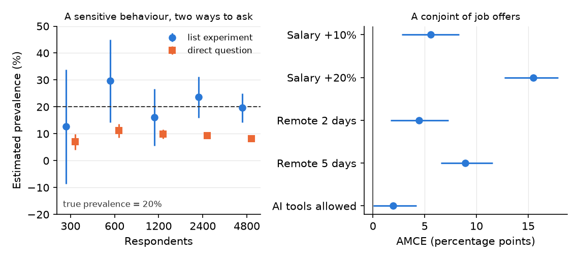
Read the left panel first. The orange squares are the direct question, and they are precise and wrong: at 1,200 respondents it reports 9.8 percent, plus or minus 1.7, and adding people only tightens the interval around the wrong answer. At 4,800 respondents the square still sits near 8 percent, less than half the true 20. The blue circles are the list experiment. At 1,200 respondents it reports 16.2 percent, plus or minus 10.5, an interval about six times wider than the direct question’s and wide enough to be nearly useless for a policy memo. At 300 respondents it reports 12.7, plus or minus 21.3, an interval that runs below zero. Only at 4,800 does it tighten to 19.6, plus or minus 5.4. Look at 600 respondents, too: 29.7 percent, far above the truth, with an interval that still covers it. Your one survey is one of these blue dots, and you do not get to choose which. That is the precision cost, and you pay it in sample size before you field anything. The trade can also run the other way. When few people shade their answer and your sample is small, the direct question’s total error can be the smaller of the two, and RDSS shows how to compare the designs on that total before you choose (Blair et al. 2023).
Now the right panel. Five remote days moved the chance an offer was chosen by 8.9 points (6.6 to 11.6). A 20 percent raise moved it by 15.5 points (12.7 to 17.9), and a 10 percent raise by only 5.6 (2.8 to 8.3). So is salary more important than remote work? The honest answer is that the question has no answer here. Put a 10 percent raise at the top of the salary menu and remote work “wins”; put 20 percent there and salary “wins”. Each AMCE describes what that level did against that baseline, averaged over the mix you dealt. Allowing AI tools moved choices by 1.9 points, with an interval from 0.0 to 4.2 that reaches down to about zero. In the companion notebook, add a fourth salary level of +30 percent to the menu, give it a bigger pull in util, and rerun. The new level earns the largest AMCE on the chart, and salary looks more important than ever, although no simulated respondent’s taste for money changed. What changed is the menu you dealt.
42.5 What a stated answer can tell you
A survey experiment measures what people say inside a questionnaire. Whether that travels to what they do is a separate claim, and it needs separate evidence.
Stated preference is what people report they would choose; revealed preference is what their actual choices show. Example: a job seeker who picks the remote offer on a screen may still accept the higher-paying office job when the real letter arrives. The good news is that this gap has been measured. In Switzerland, researchers compared conjoint and vignette experiments about which immigrants should be naturalized with real local votes on actual applicants. The survey estimates matched the behavioural benchmark well, the paired conjoint came closest, and small differences in design changed how close a survey came (Hainmueller et al. 2015). That result earns your design some credibility. It does not vouch for your topic, your population, or your wording, so your limits line still says the estimate describes stated choices.
A demand effect is a shift in answers that happens when respondents guess what you hope to find and answer toward it. Example: an employee who realizes the survey is about AI policy may suddenly favour the offer that bans AI tools. In online survey experiments this worry has been tested directly: telling participants what the researchers expected barely changed the treatment effects in five replicated studies (Mummolo and Peterson 2019). That lowers the concern for typical online designs; it does not remove it for a small, identifiable workplace sample where respondents know you.
A manipulation check is a question that confirms respondents actually noticed the feature you varied. Example: after the tax-framing paragraph, ask which phrase the paragraph used. An attention check is an item that tests whether a respondent is reading at all. Example: “To show you are reading, select ‘somewhat disagree’ here.” Decide before fielding what you will do with people who fail either one, and report results with and without them. Filtering on a check placed before the treatment keeps the coin flip’s balance, though it narrows whom your estimate describes to the attentive. Dropping people who fail a check placed after it can break the balance the coin flip bought you, because the version someone read may change whether they pass.
Language-model respondents are a new temptation. An AI tool can produce thousands of plausible survey answers in seconds, and some studies find those answers track real subgroups on certain questions (Argyle et al. 2023). Others find the simulated answers too uniform, and too unstable across prompt wordings and over time, to stand in for people (Bisbee et al. 2024). Use a model to pretest your wording, spot a confusing item, or rehearse your analysis on fake data. Never report its answers as findings about people.
Last, the ethics. A list experiment exists because the item is sensitive, and a conjoint about hiring can touch protected traits. Consent, the handling of sensitive answers, and your project’s permission status are settled before fielding, as the ethics chapter lays out. In a workplace, anonymity from your manager matters as much as anonymity in the data file.
42.6 An AI failure case
You paste your conjoint output into a chatbot and ask for the findings paragraph. It answers fluently: “Salary is the most important factor for job seekers, nearly twice as important as remote work, while AI-tool policy is irrelevant. Employers should prioritize pay over flexibility.” It even includes a tidy bar chart ranking the three attributes. This is two named failures at once. The first is plausible-but-wrong-method: it ranked attributes by comparing AMCEs whose level ranges you set differently, and the ranking would flip if you had capped salary at +10 percent. The second is silent scope change: it turned stated choices among hypothetical offers into advice about real hiring, and an interval that reaches about zero into “irrelevant.” A ranked chart is not a ranking of what people value.
You catch it by asking one question the tool cannot answer from the numbers alone: what did I put on the menu? Lay each AMCE beside the levels that produced it. Then rewrite the sentence yourself: “Among these respondents, a 20 percent raise increased an offer’s chance of being chosen by about 15 points, and five remote days by about 9, relative to the baselines shown (95 percent intervals roughly 13 to 18 and 7 to 12); these describe stated choices under the attribute mix we randomized.” Log why you rejected the ranking.
42.7 It is your turn
A further route beyond the five pathways. This lesson extends Studio 5: Develop the pathway. Read it once you have declared your primary pathway and your question calls for this design. Studio 5’s milestone asks for the same decisions, answered for this route.
Your design is declared and diagnosed. This route is for a question that a questionnaire can answer only if chance decides what each respondent sees, and it asks you to say out loud what kind of number that produces.
The hands-on half of this section lives in the chapter’s companion notebook: open it in Colab with the badge at the top, and work the steps there.
Commit your own answer first, then delegate. Each prompt is a checkable job, not a request for a verdict. Work them as a loop. The first answer is a draft: find the claim you cannot check, say so in your next message, and run it again. Some tools will draft a whole questionnaire, field it to simulated respondents, and hand you a finished analysis. The finished look is exactly what makes the questions in this chapter worth asking before you accept it.
Three calls stay yours. You decide what you randomize and which kind of number it yields, a prevalence, a preference, or the effect of a message. You decide the wording and the menu: the sensitive item, the control items, the attribute levels, because every estimate inherits them. And you decide whether a stated answer can stand in for behaviour in your write-up, and whether you may ask at all. A tool can draft items and attack your design. What the numbers mean is your call.
Name what you randomize and the kind of answer it yields. Write your Research Contract’s question line, then one line that says whether the design is a list, conjoint, vignette, or framing experiment, and whether the inquiry is descriptive (prevalence or preference) or causal (the effect of a message, or of a profile feature on stated choices), with its reach. Let the words of your question decide the kind, not the fact that you randomized.
Write your estimand and your warrant in two sentences. The estimand names the quantity, the respondents, and the setting: “the share of this firm’s staff who did X last month” or “the change in the chance an offer is chosen when it carries level L, under the attribute mix in the attached table.” The warrant names what licenses each crossing: random assignment of versions for the comparison, and your sampling for the reach.
When you are ready to delegate this step:
Act as a survey methodologist. Here is my design: [paste question, instrument
type, sample source, and estimand]. List, as a table, every assumption my
estimate rests on, for example no design effects and no liars for a list
experiment, or the attribute distribution for a conjoint. For each, say what I
could check in my own data or pilot.
After running, verify: compare the table against the assumptions you wrote first and against this chapter; if the tool missed the sampling assumption behind your reach, add it back. Counters illusion of completeness (a tidy table that omits the one assumption your reach depends on).
Draft the instrument yourself before any tool sees it. For a list experiment, write the sensitive item and four control items. For a conjoint, write the attribute table with every level. For a vignette or framing design, write both versions word for word.
Red-team your instrument.
Here are my control items and sensitive item: [paste]. Act as a hostile
reviewer. Estimate roughly what share of respondents could reach the highest or
lowest count my control items allow (remember that two items that cannot both be
true lower the highest count), name any item that could change how people count the
others, and say which item a respondent might find threatening. Do not rewrite
the list for me; list the problems so I fix them myself.
After running, verify: if it says the list looks fine, push back with “assume ceiling effects are severe; which item causes them?” Praise without an objection is a red flag. Counters sycophantic agreement (praise that reviews your ego, not your evidence).
Diagnose the design by simulation before you field it. In the companion notebook, set a plausible true value, your planned sample size, and your actual items or levels, and record the interval width your design will produce.
When you are ready to delegate this step:
Act as a Python tutor. Here is the simulation from my companion notebook with my
own items and sample size: [paste the cell]. Explain line by line how the
interval for the difference in mean counts is computed, and tell me what would
change if I asked the direct question to everyone instead.
After running, verify: rerun the cell yourself and confirm every number the tool quotes appears in your own printout. Counters confident fabrication (a fluent walkthrough quoting an interval your code never produced).
Write your limits line. Say whether the estimate describes stated or revealed behaviour, what demand effect is most plausible for your respondents, what you will do with failed attention or manipulation checks, and your permission status from the ethics chapter.
Log the step in your AI Research Ledger, and verify at least one output with a named method from the Verification Guide. A simulation is the natural check for this route: plant a known prevalence or a known AMCE, run your exact design, and confirm it recovers the planted value within its interval. Direct calculation is the strong second check: recompute one difference in means by hand from your pilot counts. An AI reviewer may run the checks with you; the decision to accept or reject stays yours.