14 Observational Descriptive Research
This chapter is part of a book in active development and has not yet been through the author’s review. Content may change as the review advances.

The research decision. Which group your observed data can honestly speak for, and where exactly the line falls past which a description of your sample is no longer allowed to become a claim about a wider population. You draw that line, and you write down the sentence on the far side of it that you refuse to say.
14.1 Why this decision matters
The decision on the table: which group your data can honestly speak for.
Picture a policy stakeholder reading your report before deciding whether it applies to their city. Their first question is never about your math. It is: “Which group did your procedure actually reach?” A result that quietly describes one group while claiming to speak for another is the most common failure in observational work: an estimate that is precise, well-formatted, and about the wrong group. This chapter equips you to name the group your data reach, and to refuse the sentence that swaps it for a group your data never touched.
14.2 The concept
This chapter follows the observational-descriptive pathway of the design library in RDSS (Blair et al. 2023). Observational descriptive research means you sample and measure without assigning anyone a condition, then summarize what you found. Example: you pull the roll call records of every member of a legislature and report how often each one crossed party lines. Because its inquiry and its answer strategy are descriptive, this pathway estimates distributions and relationships, and with care generalizes them to a population. Those estimates do not by themselves identify a causal effect. The next chapter takes the other road: observational data again, no assignment again, but a causal inquiry that has to carry an identification argument to earn its answer.
Four groups keep such a description honest (Groves et al. 2009). They are often drawn as boxes inside boxes, and that picture is worth knowing along with the place it lies.
- Target population: everyone your question is about. Example: every customer a streaming service will ever bill. This is the group you wish you could study.
- Accessible population: the part of the target you could reach in principle, given time and cost. Example: the customers you can actually contact with a survey this quarter.
- Sampling frame: the concrete list you actually draw from. Example: the current subscriber list your survey tool pulls from. This is the box that misbehaves, in three ways worth naming. Undercoverage is people who belong in your target and never make the list. Overcoverage is records on the list for people outside your target altogether. A duplicate is one person listed twice, which quietly gives them two chances of being picked. Treating the frame as a clean slice of the population above it is one of the quietest ways a description goes wrong.
- Sample: the customers you actually survey, drawn from the frame and no wider.
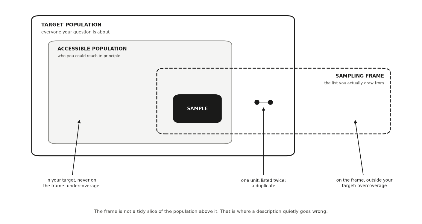
A claim is honest only when the box it describes matches the box it names. Two processes decide how the boxes differ. Selection is any process that decides who lands in your data instead of chance alone. Example: a survey taken outside one dining hall selects for people who eat there at lunch. Nonresponse is the units you drew who never gave you data. Example: of 500 people contacted, 300 reply, and the 200 silent ones are rarely a random slice. When either process relates to the very thing you are measuring, your summary drifts from the truth, and no amount of extra data pulls it back (Bethlehem 2010). Size shrinks the sample-to-sample wobble. It does nothing to a systematic tilt in who you reached (Meng 2018).
14.3 A worked example
A subscription streaming service measures its billing-error rate, meaning the fraction of customers whose monthly charge comes out wrong. Example: 2 wrong charges in 100 customers is a 2% billing-error rate. The analytics team pulls the current subscriber list, emails a short survey to a random draw from that list, and counts how many report a wrong charge in the past year. The survey reports 2%, and the headline writes itself: “the service has a 2% billing-error rate.”
Now walk the boxes. The target population is every customer the service bills (Groves et al. 2009). The sampling frame is the current subscriber list, because only people on that list receive the survey. Here is the trap: the customers hit hardest by billing errors, the ones charged twice or charged after canceling, are also the ones most likely to have quit in frustration. They removed themselves from the frame before anyone surveyed them. This is survivorship selection, a filter that keeps exactly the people least likely to show the problem you are counting. Current subscribers are the contented end of the customer base, not a fair slice of it.
So the 2% is honest about one box and dishonest about another. The licensed claim is: “among customers still subscribed, the billing-error rate is 2%.” The silent upgrade, the sentence to refuse, is: “the service’s billing-error rate is 2%.” The true rate across everyone billed is almost certainly higher, because the worst-hit customers were gone before the survey went out. That gap between the box you measured and the box you named is the subject of this chapter.
The block below builds the whole customer base, lets the worst-hit customers quit, and then reports what a perfect survey of the remaining list would find. Nothing here is a sampling error.
import numpy as np, pandas as pd
SEED = 464
rng = np.random.default_rng(SEED)

n = 50_000
# Everyone the service bills. Wrong charges are what we want to count.
wrong_charge = rng.random(n) < 0.060
# Customers hit by a wrong charge quit far more often — and quitters leave the
# subscriber list, which is the frame the survey draws from.
quit = rng.random(n) < np.where(wrong_charge, 0.70, 0.09)

target_rate = wrong_charge.mean()
frame_rate = wrong_charge[~quit].mean()
print(f"target population (everyone billed)   : {target_rate*100:.1f}%")
print(f"sampling frame (current subscribers)  : {frame_rate*100:.1f}%")
print(f"customers who left the frame          : {quit.mean()*100:.0f}%")
print("\nthe survey can only ever see the second number. no sample size,")
print("and no random draw from that list, closes the gap to the first")
14.4 A seeded simulation
The worked example argues that who you reach tilts what you measure, and that a bigger sample does not fix the tilt. You can watch that happen. A seed is a fixed starting point for a random-number generator: the same seed always reproduces the same draws, so the figure below is exactly what you will get when you run this code in the companion notebook. The code builds a population of 100,000 people whose true mean age is known by construction, draws ten honest random samples of 500, then draws one convenience sample of the same size through a channel that mostly reaches younger people.
import numpy as np
import matplotlib.pyplot as plt

SEED = 464
rng = np.random.default_rng(SEED)

population = np.clip(rng.normal(49, 17, size=100_000), 18, 90)
truth = population.mean()

random_means = [rng.choice(population, 500, replace=False).mean()
                for _ in range(10)]

weights = np.exp(-(population - 25) ** 2 / (2 * 12 ** 2))  # younger = likelier
convenience = rng.choice(population, 500, replace=False,
                         p=weights / weights.sum())

fig, ax = plt.subplots(figsize=(7.6, 2.9))
ax.scatter(random_means, np.ones(10), s=60, color="#2a78d6", zorder=3)
ax.scatter([convenience.mean()], [0], s=60, color="#eb6834", zorder=3)
ax.axvline(truth, color="#333333", ls="--", lw=1.2)
ax.text(truth + .5, 1.55, f"true mean = {truth:.1f}", color="#333333",
        fontsize=9)
ax.set_yticks([0, 1], ["Convenience\nchannel (n = 500)",
                       "Random samples\n(n = 500)"], fontsize=9)
ax.set_xlabel("Sample mean age (years)")
ax.set_ylim(-.7, 1.9)
plt.show()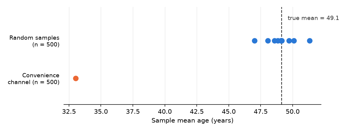
Read it the way a reviewer would. The ten random samples never agree exactly: their means spread between about 47 and 51. But they huddle around the truth, and that spread is honest, quantifiable uncertainty. The convenience channel has exactly the same sample size, and it misses the true mean by about sixteen years. Nothing about the dot itself warns you; it looks as confident as any other. Only the sampling procedure tells you which kind of dot you have. In the companion notebook, move the channel’s center (the 25 inside weights) and rerun: the tilt follows the channel, never the sample size.
14.5 Description over time
A labor ministry reports that the average hourly wage of employed workers rose 2.6% during a recession. Nobody at the ministry made an arithmetic error, and nobody’s pay went up. The number moved because the group it describes changed underneath it. That is the first thing to check whenever a description has a date on it.
Two designs collect the same kind of number over time, and they reach different groups. A repeated cross-section is a fresh sample drawn from the population at each point in time. Example: a national labor survey that interviews a new random set of households every month. A panel is one sample of units followed and measured again and again. Example: a study that re-interviews the same 3,000 households every year for a decade (Lynn 2009). The repeated cross-section licenses a sentence about the population as it stood at each date. The panel licenses a sentence about how the units you started with changed, which is the only design of the two that can see any one household’s path. Those units stand for the population as it stood when the panel was drawn. A household formed five years later is not in it unless the study adds new members along the way.
Each design has its own way of misleading you. A repeated cross-section’s averages fold in composition change, meaning a shift in a group’s average that comes from who belongs to the group, not from any member changing. Example: when lower-paid workers lose their jobs first, the average wage of the people still employed rises, even though every remaining worker earns exactly what they earned before. That shift is a true fact about the population. It misleads only when you read it as a change in what people are paid. A panel suffers from attrition, meaning units that drop out between waves. Example: a household that moves away after the second interview never answers the third. Attrition is the same survivorship selection that removed the angriest customers from the streaming service’s subscriber list, because the households that move, fall ill, or stop answering are rarely a random slice. Panels also suffer from panel conditioning, meaning that being asked the same questions repeatedly changes how people behave or answer. Example: a household asked every month about its savings starts paying closer attention to them.
The block below builds a workforce in which no wage ever changes, lets a downturn take jobs mostly from the lower-paid, and compares the two designs.
import numpy as np, pandas as pd
SEED = 464
rng = np.random.default_rng(SEED)

n = 20_000
# Each worker's hourly wage is FIXED. Nobody gets a raise or a cut.
wage_before = rng.lognormal(mean=np.log(22), sigma=0.45, size=n)
wage_after = wage_before.copy()
# In the downturn, lower-paid workers lose their jobs far more often.
low_paid = wage_before < np.median(wage_before)
lose_job = rng.random(n) < np.where(low_paid, 0.18, 0.04)

before = wage_before.mean()             # everyone employed before
after = wage_after[~lose_job].mean()    # whoever is employed after
panel = (wage_after - wage_before)[~lose_job].mean()  # same people, followed

print(f"mean wage of the employed, before : ${before:.2f}")
print(f"mean wage of the employed, after  : ${after:.2f}")
print(f"change in the headline average    : {100*(after/before - 1):+.1f}%")
print(f"workers who left the employed pool: {lose_job.mean()*100:.0f}%")
print(f"panel: change for workers followed: ${panel:.2f}")
print("\nthe average rose because WHO is employed changed,")
print("not because anyone was paid more")
The headline average climbs from $24.31 to $24.94, a 2.6% rise, after 11% of workers leave the employed pool. The panel of workers who kept their jobs shows a change of exactly zero. Both numbers are correct. They answer different questions, and only your sentence decides which one you are asking.
Two more traps sit in any series. The first is serial dependence, meaning that each period’s value is tied to the one before it. Example: a store’s sales in March look a lot like its sales in February, because the same customers, prices, and staff carry over. When consecutive months move together like this, twenty-four monthly values hold less independent information than twenty-four separate draws, and an interval for their average computed as if they were independent comes out too narrow. The second is the base period of an index, meaning the date the index is set to 100 so later values read as change from it. Example: a price index based in a year when prices had dipped puts every later year well above 100, so “prices are up 30% since the base year” sounds dramatic even though the change from one year to the next is exactly the same under any base. Name the base period, and check whether a different, equally defensible one changes your sentence.
An AI tool is fast at the mechanical part of this work. It can split a series by who entered and who left, recompute an index on a new base period, or draft the table that sets the stayers’ wages beside the leavers’. It is weak at the sentence. Ask a chatbot to summarize the wage series and it can easily write that wages rose, a silent scope change from “the average among the employed” to “what workers are paid.” Which group the number describes is your call, and you check the tool’s summary against it.
A description over time declares its estimand in words: the population’s average at each date, or the average change for the units you followed. Its warrant is the same sampling license as the rest of this chapter, applied once per wave, plus a documented account of who left a panel. What it cannot establish is why the series moved. Attributing a break in the line to a policy that arrived that month is a causal claim, and it needs a design built for it. The interrupted time series in Natural Experiments is where that claim gets its argument.
14.6 Description over space
A state health department publishes a county map of a tick-borne disease. The darkest counties sit in one corner of the state, and a reporter writes that the corner is a hot spot. Before you repeat that sentence, ask three questions of the map: what the color divides by, how big each county is, and where the lines were drawn.
The first question is about the denominator. A rate is a count divided by the number of people who could have produced it. Example: 12 cases among 30,000 residents is 40 cases per 100,000. A map of raw counts is mostly a map of where people live, since big counties have more of everything. When your question is about risk, map the rate and state its denominator in the legend. Map the count only when the question is where the most cases are, for example to decide where to send clinic staff.
The second question is about size. A small county’s rate rests on very few people, so chance alone swings it far above or below the truth. The block below gives every one of 300 counties exactly the same true rate, 40 cases per 100,000 residents, then counts the cases chance produces.
import numpy as np, pandas as pd
SEED = 464
rng = np.random.default_rng(SEED)

# 300 counties, from tiny to large. The TRUE rate is identical everywhere:
# 40 cases per 100,000 residents. No county is riskier than any other.
pop = np.round(np.exp(rng.uniform(np.log(1_000), np.log(500_000), 300))).astype(int)
cases = rng.poisson(pop * 40 / 100_000)
rate = cases / pop * 100_000

counties = pd.DataFrame({"pop": pop, "rate": rate})
highest = counties.nlargest(10, "rate")     # the darkest counties
zero = counties[counties["rate"] == 0]      # the palest: no cases at all
print(f"true rate in every county           : 40.0 per 100,000")
print(f"median county population            : {np.median(pop):,.0f}")
print(f"10 highest observed rates           : median pop {highest['pop'].median():,.0f}, "
      f"largest {highest['pop'].max():,}")
print(f"{len(zero)} counties with zero cases         : median pop {zero['pop'].median():,.0f}, "
      f"largest {zero['pop'].max():,}")
print(f"lowest / highest observed rate      : {rate.min():.1f} / {rate.max():.1f}")
print("\nthe darkest and the palest counties on the map are")
print("the smallest ones: the map is showing you noise")
The typical county has about 28,500 residents. The ten counties with the highest observed rates have a median of about 1,500 residents, and none has more than 4,955. At the other end, 23 counties recorded no cases at all; their median is about 2,400 residents, and the largest has 6,413. Observed rates run from 0 to about 197 per 100,000 in a state where every county’s true rate is 40. Both ends of the color scale belong to the smallest places. Before you call a county a hot spot, put its population and an interval beside its rate.
The third question is about the lines. The modifiable areal unit problem is the fact that a summary computed over areas can change when you redraw the areas or change their size, even though no person moved. Example: the link between income and turnout computed across a state’s counties can differ from the same link computed across the precincts inside them, with exactly the same voters. Fotheringham and Wong showed that regression estimates computed on grouped data shift with both the size and the layout of the zones, in ways that are hard to predict in advance (Fotheringham and Wong 1991). When you can, rerun the summary at a second scale or on a second set of boundaries. If your finding appears at one scale only, report the scale in the claim.
Places also break a rule that most interval formulas assume: that the observations are independent. Spatial autocorrelation means that nearby places tend to have similar values. Example: neighboring counties share weather, deer populations, and commuters, so their tick counts rise and fall together. The geographer Waldo Tobler put it as a law: near things are more related than distant things (Tobler 1970). For you it means that 300 counties are not 300 independent observations when neighbors share what drives their numbers. An interval for a statewide average or trend computed as if they were independent usually comes out narrower than the evidence supports, which is the same trap serial dependence sets in a time series.
The last trap is about people. The ecological fallacy is reading a relationship measured across areas as if it held among the individuals inside them. Robinson’s classic case measured it with a correlation, a number from −1 to 1 that says how closely two quantities rise and fall together. Example: 0 means no straight-line link, and a negative value means one tends to be high where the other is low. Robinson used United States census data from 1930. Across individuals, being born abroad was slightly positively correlated with being unable to read (0.118). Across the 48 states, the share born abroad and the share unable to read were negatively correlated (−0.526) (Robinson 1950). The state correlation also depends on things the individual one ignores, such as where immigrants settled and how well everyone else in those states could read, so it can point the opposite way from the pattern among people. The state numbers were accurate, and they answered a question about states. Read as a statement about people, they pointed the wrong way.
So a spatial description declares its estimand as a rate for each area, or a summary across areas, and states its unit (counties, not residents), its denominator, its scale, and an interval that respects neighbors. Its warrant runs to the areas you covered, at the boundaries you used. It cannot tell you which individuals are at risk, and it cannot tell you why one place differs from its neighbor. An AI tool can build a choropleth, a map that shades each area by its value, in seconds. It may also label the darkest cluster a hot spot with no interval and no population beside it. That label is a claim you check, not a finding you inherit. When the question becomes why two neighboring places differ after one of them changed a rule, it has turned causal, and comparisons across a border are one of the designs in Natural Experiments.
14.7 A language model is not a sample of people
A political scientist wants to know how warmly voters feel toward a party. A chatbot offers to answer the questionnaire a thousand times, “as” a thousand voters with different ages, incomes, and home states. The answers arrive in minutes, tidy and cheap. It is tempting to treat them as survey data. Resist that temptation.
Political scientists have tested this idea directly. Argyle and colleagues coined the term silicon sample, meaning a set of answers generated by a language model that has been told to respond as a person with a given background. Example: prompting a model with “I am a 45-year-old retired teacher from Ohio” before each survey question. They built the backgrounds from thousands of real participants in large United States surveys and reported that, conditioned this way, the GPT-3 model reproduced the answer patterns of many demographic subgroups closely. They called that property algorithmic fidelity and argued that a model is useful as a stand-in only to the extent that it has enough of it for the question at hand (Argyle et al. 2023). Bisbee and colleagues then gave ChatGPT personas copied from the backgrounds of real survey respondents, asked it to rate eleven social and political groups, and compared its answers with what the people had said. The synthetic averages were close to the survey’s. The synthetic answers varied far less than real ones, relationships estimated from them often differed from the relationships in the human data, and the results shifted with small changes in prompt wording and when the same prompt was run again three months later. They concluded that the synthetic answers were not reliable for statistical inference (Bisbee et al. 2024).
The deeper problem is the one this whole chapter is about: which group do the numbers speak for? Notice what was sampled in both studies. The backgrounds were copied from real respondents, so the mix of ages, incomes, and states in the prompts can match a probability sample of voters. The answers were not drawn from those voters. The model wrote every one of them. A sampling license covers what was sampled, so here it covers the list of personas, and nothing connects the ratings themselves to any population of people. Only a check against real answers, question by question, can show how close they come. The reach of the answers is the model itself, at one version, on one date, with one prompt, one set of personas, and one set of generation settings. The block below makes that concrete with constructed numbers, not ones taken from any study.
import numpy as np
SEED = 464
rng = np.random.default_rng(SEED)

# CONSTRUCTED for illustration, not taken from any study:
# people rate a political group on a 0-100 "feeling thermometer."
people = np.clip(rng.normal(55, 26, 1_000), 0, 100)
# A model asked to answer "as" 1,000 personas lands near the same
# average but squeezes everyone toward the middle.
silicon = np.clip(rng.normal(57, 8, 1_000), 0, 100)

for name, x in [("people ", people), ("silicon", silicon)]:
    se = x.std(ddof=1) / np.sqrt(len(x))
    print(f"{name}: mean {x.mean():5.1f}  (95% interval "
          f"{x.mean()-1.96*se:4.1f} to {x.mean()+1.96*se:4.1f})  "
          f"share above 80: {100*(x > 80).mean():4.1f}%")
print("\nthe averages look alike; the spread, and every claim built on it,")
print("does not. the silicon interval is about the model, not about people")
The two averages differ by about a point: 55.8 for the people and 57.0 for the silicon answers. Everything built on the spread comes apart. Among the people, 17.9% give a rating above 80. Among the silicon answers, 0.2% do. The silicon interval, 56.5 to 57.5, is also far narrower than the people’s interval, 54.2 to 57.3, and it misses the people’s average entirely. A thousand generated answers make the estimate precise, and it is a precise estimate of what the model says. That is the billing-error lesson again: size shrinks the wobble and leaves the tilt in place.
None of this makes a language model useless to a survey researcher. It can be a useful assistant for work that happens before you field a questionnaire. It can flag a question that is confusing or double-barreled (asking two things at once), suggest answer options you forgot, role-play a hurried respondent so you notice a skip that makes no sense, or help you draft probes for a later round of cognitive interviews, sessions in which real people answer a draft question and say aloud how they read it. Example: a respondent explains that “household income” made her wonder whether to count her roommate. Every one of those uses improves an instrument that people will answer. What it cannot do is stand in for the people. A silicon result reported as “voters feel…” is a silent scope change from the model to a population whose answers nobody collected.
If a model’s answers are what you want to describe, say so, and design for it: the model is then your object of study, and the audit designs in Audit Studies show how to vary inputs and count repeated outputs honestly. If you want to pretest the wording of a survey experiment, Survey Experiments shows where a pretest ends and a result begins.
14.8 An AI failure case
You ask a chatbot: “My survey of current subscribers shows a 2% billing-error rate on a large panel. Can I report the service’s billing-error rate as 2%?” It answers with full confidence: “Yes. With a sample that large, your estimate is precise and reliable.” This is wrong in two named ways at once. It commits a silent scope change, quietly upgrading “current subscribers” to “the service’s customers,” and it leans on the fallacy that a big sample cures a tilted one.
You catch it because you wrote your own answer first, and yours named the frame: the customers still subscribed, not everyone the service bills, so the swap is visible on sight. Then you check the mechanism against the data. The customers with the worst billing errors canceled before the survey went out, so missingness relates directly to the outcome you count. A larger panel of current subscribers only estimates the current subscribers’ error rate more precisely. It never reaches the people who left.
14.9 It is your turn
You are working inside Studio 5: Develop the pathway. This lesson serves the observational-descriptive pathway. If your declared pathway is different, skim it and work the lesson that matches; the studio page routes you.
You arrive with a declared and diagnosed design. This chapter is the first of the pathway chapters, so your job now is either to build your design out on this pathway or to use it to stress-test the pathway you chose.
The hands-on half of this section lives in the chapter’s companion notebook: open it in Colab with the badge at the top, and work the steps there.
Commit your own answer first, then delegate. Each prompt below leaves the judgment with you and hands the AI only the legwork. Work them as a loop rather than a one-shot: the first list of dropout groups is always the obvious one, and the useful answer usually arrives on the second or third pass, after you have told the tool which group it missed and asked it to try again with that in mind.
Three decisions stay yours alone. First, which population your project is really about: the AI does not know your question’s intent. Second, which frame you can honestly reach, and therefore the coverage gap you must disclose. Third, the boundary line itself: the exact sentence where your description stops and the population claim you refuse to make. You may ask an AI to attack that line, never to draw it for you.
Decide which case you are in. Read your inquiry’s words. If it asks how much, how many, how often, over a group you will observe rather than assign, this is your pathway. If it asks why or what would happen if, it is not, and you run the drill in step 5 instead.
If this is your pathway, write your four boxes, one line each: target population, accessible population, sampling frame, sample. Be concrete about the frame. Name the actual list, database, or feed your data will come from.
Draw your selection diagram: an arrow from each box to the next, with the filter that removes people written on the arrow. Circle the one filter you most fear bends both who you reach and what you measure. That is the one you will have to disclose.
List-to-verify. Turn a vague worry into a checkable list of who drops out.
I am drawing a selection diagram for an observational study. My target
population is [X], my frame is [Y], my sample is [Z]. List each group that
drops out between target and sample, in a table, with whether their absence
pushes my estimate up or down.
After running, verify by mapping each named group to one real step in your own diagram, and checking that the one group you feared most is on the list. Counters illusion of completeness: a long, tidy list that quietly omits the group that matters most.
Write the two sentences that define your claim. The first is the population claim your frame actually licenses, stated with its uncertainty. The second is the silent upgrade your design forbids, written out in full so you can recognize and refuse it when a coauthor or an AI hands it back to you.
Red-team. Make the AI attack your boundary sentence instead of praising it.
Here is a boundary sentence I wrote: "[your sentence]". Act as a hostile peer
reviewer. Name every place it over-reaches, under-states the bias, or hides the
direction of the drift. Do not rewrite it for me.
After running, verify by checking each objection against your own numbers and pushing back if every objection is mild. Counters sycophantic agreement: an AI that calls your caveat “well-balanced” has reviewed your ego, not your evidence.
If this is not your pathway, run the classification drill instead. Write your question as if it were an observational descriptive question, name the four boxes it would need, and say precisely what that version could not tell you. The sentence you cannot write here is the reason your chosen pathway has to earn its extra assumptions.
Log the work in your AI Research Ledger, and verify the key claim with a named method from the Verification Guide; simulation fits here, because the claim is about how a sampling procedure behaves rather than about a fixed number. An AI reviewer may attack your boundary sentence with you; the decision to hold the line or move it stays yours.
Locate. Find real methodological backing instead of trusting a paragraph.
Act as a research-methods assistant. List real, retrievable references on
survivorship and nonresponse bias in observational studies. For each, give
title, authors, year, and venue, and mark any you are not confident exist.
After running, verify by opening each source in a library database before you cite it. Counters confident fabrication: a fluent citation for a paper that does not exist looks identical to a real one until you try to retrieve it.