41 Natural Experiments: Difference-in-Differences, Discontinuities, and Interrupted Time Series
This chapter is part of a book in active development and has not yet been through the author’s review. Content may change as the review advances.

The research decision. When a law, a date, or a cutoff assigned the treatment instead of you, decide which comparison you are willing to defend as the world that did not happen, and write down the one assumption that makes it stand in. The rule is in the documents and the assumption is in your sentence, so no tool gets to declare that the comparison it found is the counterfactual.
41.1 Why this decision matters
The decision on the table: which comparison you will defend as the world where the rule never applied.
“You tell me employment fell after the wage law passed. Employment also fell in the county next door, which passed nothing. Before I read your effect, tell me what you are subtracting, and why that county is the right thing to subtract.” — a state budget analyst, reading a memo on a minimum-wage increase
A state raises its wage floor on a fixed date. A scholarship goes to every applicant who scores 70 or higher. A city bans smoking in bars from the first of the month. Each rule hands you a treated group for free. None of them hands you the missing world. You still have to pick a comparison: the neighboring state, the applicants who scored 69, the months before the ban. Pick badly and a regional recession, a lucky cohort, or a winter flu season wears the policy’s name. Pick well and say why, and a policy question that no one could ever randomize gets a bounded, defensible causal answer. This chapter gives you three ways to build that comparison and the check each one owes a skeptical reader.
41.2 The concept
This chapter extends the observational-causal pathway you met earlier in Observational Causal Research. There, a natural experiment was a situation where a force outside anyone’s control decided who got treated. Two of the three designs below, difference-in-differences and regression discontinuity, are declared in the observational-causal section of the design library in RDSS, with their estimands and their failure points diagnosed by simulation (Blair et al. 2023).
An assignment rule is the written procedure that decided which units were treated and when. Example: a statute that raises the minimum wage in one state on April 1, or a program manual that funds every applicant scoring 70 or above. You find the rule in primary documents: the law itself, the agency’s notice, the program’s scoring sheet. A news story about the rule is a lead, not the rule. Read it exactly, including the exemptions, the announcement date, and whether anyone could see the rule coming and act early.
41.2.1 Difference-in-differences: change against change
Difference-in-differences is a design that compares how much the treated group changed with how much an untreated group changed over the same period. Example: employment in fast-food restaurants in a state that raised its wage floor fell by three workers per store, while stores across the border fell by two, so the difference-in-differences is minus one. Subtracting the neighbor’s change removes whatever hit both places at once, such as a regional downturn or a holiday season.
The quantity this design targets is the average effect on the treated, the average change the policy caused among the units that actually got it, in the periods after it began. Example: the effect of this raise on these stores in these quarters, not the effect of every minimum wage everywhere.
One assumption carries the whole design. Parallel trends is the assumption that, without the policy, the treated group’s outcome would have moved, on average, by the same amount as the comparison group’s. Example: had the wage law never passed, employment at the treated stores would have fallen by the same two workers as the stores across the border. You can never observe that sentence, because the law did pass. You can only make it plausible.
The tool for making it plausible is the event study, a chart of the treated-minus-comparison gap period by period, before and after the policy, each measured relative to the last period before it began. The pre-policy estimates are called leads. Example: if the gap was already widening in the four quarters before the raise, the leads slope, and the comparison state was a poor stand-in from the start. Leads that slope are a warning you should act on. Leads that sit near zero are reassuring and nothing more, because a pre-period check can be too imprecise to see a real divergence, and because trends can part ways exactly when the policy arrives (Roth 2022; Roth et al. 2023).
Two quieter assumptions ride along. No anticipation means the treated units did not change course before the policy began. Example: if owners cut staff when the law was announced, months before it took effect, your “before” period already holds part of the effect. No spillover means the policy did not reach the comparison group. Example: if workers who lost hours crossed the border to take jobs, the comparison stores changed because of the law too. The closeness that makes a neighbor a good comparison is what lets a policy leak across the line.
One warning concerns timing. When units adopt a policy on different dates, say states raising their wage floors in different years, the common shortcut of one regression with a term for each unit and each period can quietly compare late adopters with early adopters whose effects are still unfolding, and the weighted average it returns can even carry the wrong sign. Newer estimators compare each adopting group only with units not yet treated or never treated, and a review of them is the place to start before you write that regression (Roth et al. 2023).
41.2.2 Regression discontinuity: the effect at the line
Regression discontinuity is a design that compares units just above and just below a cutoff on a score that decides treatment. Example: small firms that scored 70 on a grant application received the grant, firms that scored 69 did not, and a point of score says little about a firm’s prospects. The score is the running variable, the number the rule reads, and the cutoff is the value where treatment switches on. The design estimates the jump in the outcome right at the line (Lee and Lemieux 2010).
The estimand is narrow on purpose: the effect for units whose score sits at the cutoff. Example: what the grant did for firms that scored about 70, not for a firm that scored 40. The warrant is continuity, the assumption that, without the rule, average outcomes would change smoothly as the score crosses the line. Here every firm at 70 or above got the grant. If crossing the line only raised the chance of treatment, say because some winners turned the grant down, the jump would measure the effect of becoming eligible; recovering the grant’s own effect (a fuzzy discontinuity) is a step to learn with a mentor.
The bandwidth is how far from the cutoff you reach for data. Example: firms scoring 60 to 80 rather than 40 to 100. A narrow bandwidth compares more similar units but uses fewer of them, so the interval widens. A wide one is more precise and leans harder on the straight line you drew. Fix the bandwidth, or the data-driven rule that will choose it, before you see the estimate, and report the answer at two or three bandwidths. Published work goes further: it lets a rule pick the bandwidth that best trades bias against noise, weights applicants more heavily the closer they sit to the line, fits straight lines or gentle curves near the cutoff rather than one high-order curve across the whole score range (Gelman and Imbens 2019), and reports an interval built to survive the bias a straight line leaves behind (Calonico et al. 2014). The rdrobust package, written by the authors of that interval, does all of this. Sorting is units nudging their own score across the line. Example: applicants who learn the cutoff and rewrite a borderline application. You look for it in a density check, a count of units just below and just above the cutoff; a pile-up on the side the rule rewards is a warning. And you check covariate balance at the cutoff: traits fixed before the score, such as firm age, should not jump at 70 (Cattaneo et al. 2020).
41.2.3 Interrupted time series: one unit, many periods
An interrupted time series is a design that follows one unit over many periods and compares what happened after a policy with the path the earlier periods projected. Example: monthly hospital admissions for heart attacks in one region, before and after a smoking ban in bars. The counterfactual is the pre-ban trend, carried forward. The design is common in public health, where a whole population is treated at once (Bernal et al. 2017).
Its weak points are easy to name. Seasonality is a pattern that repeats every year, such as winter admission spikes, which can pass for a policy effect if the policy starts in spring. A competing event is anything else that changed on the same date, such as a new tax on cigarettes, and the series alone cannot tell the two apart. Months are also not independent pieces of evidence: a busy month tends to follow a busy month, and an interval that ignores this comes out too narrow. A comparison series, an untreated region or an outcome the policy should not touch, turns the design into a close cousin of difference-in-differences.
41.2.4 What the three designs license
On the compass, all three serve a causal question. The crossing license is identification: an argument, grounded in how the rule assigned treatment, that the comparison stands in for the missing world. With no further argument, the reach is the data at hand: the treated units you observed, in the periods you observed, or the applicants near the cutoff. The interval still belongs in the answer, because it says how far the estimate could move if the same units ran through the same periods again with fresh noise. If those units were drawn by a sampling procedure from a larger list, say a random sample of every fast-food restaurant in the state, sampling can carry the answer to that population. Carrying it to another state, another decade, or scores far from the line is a transported effect, which needs its own argument. And if the assumption cannot be made plausible, say so: causal, currently unidentified is a legitimate conclusion.
The failure this chapter watches for has a name you already know. Design mimicry is borrowing a design’s vocabulary for a comparison that never met its assumption. Example: calling a plain before-and-after comparison in one state a “difference-in-differences”, or calling any threshold a “discontinuity” when applicants could see it and aim for it.
An AI partner can find the statute behind a date, fit an event study in seconds, and list competing events you had not thought of. It is also the fastest route to design mimicry, because it will run any of these designs on any data you hand it and label the output with the design’s name. It cannot know whether applicants saw the cutoff coming, or which bandwidth you meant to use before you saw the answer. AI is your arm and your research assistant, not your brain: the rule, the comparison, and the assumption stay with you.
A question that often comes up here: “Can’t I just test whether the trends were parallel and be done?” You can test whether the leads look flat. You cannot test the counterfactual after the policy starts. Report the leads with their intervals, say how large a divergence your check could have seen, and keep the assumption in your limitations.
41.3 A worked example
Bring this into labor economics. Two neighboring states share a border, a labor market, and the same weather. State A raises its minimum wage; State B does not. You survey 200 fast-food restaurants on each side in the quarter before the raise and again in the quarter after, and you count full-time-equivalent workers. This is the setting of a well-known study that surveyed 410 fast-food restaurants in New Jersey and eastern Pennsylvania before and after New Jersey’s 1992 increase and compared their employment changes (Card and Krueger 1994). The numbers below are constructed for this example. They do not come from that paper, whose authors found no indication that the raise reduced employment.
In the constructed world, a regional downturn cuts two workers per store on both sides of the border, and the raise itself cuts one more, only in State A. A reporter who looks only at State A sees a drop of almost three workers and blames it all on the law. That is a before-and-after comparison, and it cannot tell the law from the downturn. State B is your stand-in for the missing world: its change is your estimate of what State A would have done without the raise. Subtract it and the downturn cancels, if and only if the two states would have moved together.
The block below builds that world and computes both numbers. Watch the gap between the first line and the last.
import numpy as np, pandas as pd
SEED = 464
rng = np.random.default_rng(SEED)

n = 200                                   # restaurants on each side of the border
# Constructed world: a regional downturn cuts 2.0 workers EVERYWHERE,
# and the wage raise itself cuts 1.0 more, only in State A.
state = np.repeat(["A (raise)", "B (no raise)"], n)
before = rng.normal(20, 4, size=2 * n)
after = before - 2.0 - 1.0 * (state == "A (raise)") + rng.normal(0, 1.5, size=2 * n)
df = pd.DataFrame({"state": state, "change": after - before})

g = df.groupby("state")["change"].agg(["mean", "var", "size"])
a, b = g.loc["A (raise)"], g.loc["B (no raise)"]
did = a["mean"] - b["mean"]
se = np.sqrt(a["var"] / a["size"] + b["var"] / b["size"])
print(f"true effect of the raise           : {-1.0:+.2f} workers")
print(f"before/after, State A only         : {a['mean']:+.2f}")
print(f"before/after, State B only         : {b['mean']:+.2f}")
print(f"difference-in-differences          : {did:+.2f}  "
      f"(95% interval {did - 1.96*se:+.2f} to {did + 1.96*se:+.2f})")
print("\nthe before/after number blames the raise for the downturn;")
print("State B is what lets you subtract it, IF A would have moved like B")
State A’s stores changed by -2.92 workers, State B’s by -1.95, and the difference-in-differences is -0.97, with a 95% interval from -1.27 to -0.67. The true effect we planted was -1.00. Now read that interval with suspicion. It treats the 400 restaurants as 400 independent pieces of evidence, but the policy varied between only two states. Anything else that hit State A alone in that quarter, a plant closing or a bad tourist season, moves every store in A together and lands inside your estimate. With two states, no formula can separate that from the law, so the real uncertainty is wider than the printed interval. Say so in the write-up, and add comparison states or earlier quarters if you can get them.
41.4 A seeded simulation
The left panel shows what an event study can and cannot tell you about parallel trends. It follows 200 and 200 restaurants for eight quarters, in two worlds with the same true effect of -1.0 worker: one where the states would have moved together, and one where State A was already losing 0.4 workers per quarter relative to State B before the raise. The right panel shows a regression discontinuity: 2,000 simulated grant applicants, a grant at a score of 70, and a true jump of 1.5 jobs a year later. The code also runs a stress test it does not plot: the same applicants with a differently shaped curve. The seed makes every run reproduce this exact figure and every printed number.
import numpy as np
import matplotlib.pyplot as plt

SEED = 464
rng = np.random.default_rng(SEED)

# Event study: 200 stores per state, quarters -4..3, raise at quarter 0.
n, quarters, tau = 200, np.arange(-4, 4), -1.0
def event_study(extra_trend):             # extra_trend < 0: A was ALREADY sliding
    base = rng.normal(20, 4, size=(2 * n, 1))
    shock = rng.normal(0, 0.5, size=quarters.size)       # hits both states
    treated = np.repeat([True, False], n)[:, None]
    y = (base + shock + extra_trend * quarters * treated
         + tau * treated * (quarters >= 0)
         + rng.normal(0, 1.5, size=(2 * n, quarters.size)))
    d = y - y[:, [3]]                                     # change since quarter -1
    est = d[:n].mean(0) - d[n:].mean(0)
    se = np.sqrt(d[:n].var(0, ddof=1) / n + d[n:].var(0, ddof=1) / n)
    change = y[:, 4:].mean(1) - y[:, :4].mean(1)          # after avg minus before avg
    did = change[:n].mean() - change[n:].mean()
    did_se = np.sqrt(change[:n].var(ddof=1) / n + change[n:].var(ddof=1) / n)
    return est, se, did, did_se
par, par_se, did_par, se_par = event_study(0.0)
vio, vio_se, did_vio, se_vio = event_study(-0.4)
for name, est, did, s in (("parallel", par, did_par, se_par),
                          ("sliding ", vio, did_vio, se_vio)):
    print(f"{name}: leads {np.round(est[:3], 2)}, after {np.round(est[4:], 2)}, "
          f"overall {did:+.2f} ({did - 1.96*s:+.2f} to {did + 1.96*s:+.2f})")

# Regression discontinuity: grant at score >= 70, true jump 1.5 jobs.
m, cut, jump = 2000, 70, 1.5
score = rng.uniform(40, 100, m)
x = score - cut
noise = rng.normal(0, 2.0, m)
jobs = 5 + 0.08 * x + 0.0008 * x**2 + jump * (x >= 0) + noise
# Stress test: the same applicants and noise, but an S-shaped curve that climbs
# fastest near the cutoff and levels off at both ends. The true jump is still 1.5.
bent = 5 + 3 * np.tanh(x / 12) + jump * (x >= 0) + noise
def rd(h, y=jobs):                         # local straight lines within h points
    ends, ses = [], []
    for side in (x < 0, x >= 0):
        k = side & (np.abs(x) <= h)
        X = np.column_stack([np.ones(k.sum()), x[k]])
        b = np.linalg.lstsq(X, y[k], rcond=None)[0]
        r = y[k] - X @ b
        ses.append(np.sqrt((r @ r / (k.sum() - 2)) * np.linalg.inv(X.T @ X)[0, 0]))
        ends.append(b)
    return ends[1][0] - ends[0][0], np.hypot(*ses), ends
for h in (5, 10, 20):
    e, s, _ = rd(h)
    print(f"bandwidth {h:2d}: jump {e:.2f} (95% interval {e-1.96*s:.2f} to {e+1.96*s:.2f})")
for h in (5, 10, 20):
    e, s, _ = rd(h, bent)
    print(f"S-curve, bandwidth {h:2d}: jump {e:.2f} ({e-1.96*s:.2f} to {e+1.96*s:.2f})")
print("applicants scoring 65-69.9:", ((x >= -5) & (x < 0)).sum(),
      "| scoring 70-74.9:", ((x >= 0) & (x < 5)).sum())

fig, (ax1, ax2) = plt.subplots(1, 2, figsize=(10.4, 3.8))
ax1.errorbar(quarters - .12, par, yerr=1.96 * par_se, fmt="o", color="#2a78d6",
             capsize=2, label="parallel trends hold")
ax1.errorbar(quarters + .12, vio, yerr=1.96 * vio_se, fmt="s", color="#eb6834",
             capsize=2, label="treated state already sliding")
ax1.plot([-0.5, 3.4], [tau, tau], color="#333333", ls="--")
ax1.axhline(0, color="#bbbbbb"); ax1.legend(fontsize=8)
edges = np.arange(40, 100.01, 2.5); bins = np.digitize(score, edges) - 1
ax2.scatter((edges[:-1] + edges[1:]) / 2,
            [jobs[bins == i].mean() for i in range(edges.size - 1)], color="#777777")
_, _, (b0, b1) = rd(10)                    # the two local lines at bandwidth 10
xl, xr = np.linspace(-10, 0, 20), np.linspace(0, 10, 20)
ax2.plot(cut + xl, b0[0] + b0[1] * xl, color="#2a78d6")
ax2.plot(cut + xr, b1[0] + b1[1] * xr, color="#2a78d6")
ax2.axvline(cut, color="#333333", ls="--")
plt.show()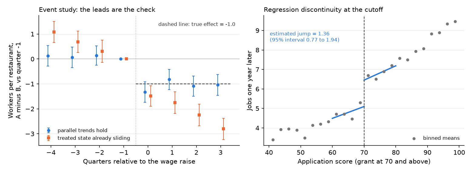
Read the left panel first. In the blue world, the three leads sit between +0.07 and +0.14 workers, each with an interval of about plus or minus 0.4 that covers zero. After the raise, the blue estimates hover around the true -1.0. The overall difference-in-differences, which compares each store’s average over the four quarters after the raise with the four before, comes out at -1.15 (95% interval -1.36 to -0.95). In the orange world the leads slope: +1.08 four quarters out, +0.68 three quarters out, +0.31 two quarters out. State A was already falling behind, so the post-policy estimates keep sliding to -2.81 by the fourth quarter, and the overall difference-in-differences reads -2.59 (95% interval -2.80 to -2.38). That interval is narrow and nowhere near the truth. A sloped trend is not noise, and 400 restaurants make the wrong number precise rather than right. Notice also the orange lead closest to the policy: +0.31 with an interval that crosses zero. Someone who checked only that one quarter would have called the trends parallel.
Now the right panel. At a bandwidth of 10 points the estimated jump is 1.36 jobs (95% interval 0.77 to 1.94), against a true 1.5. At 5 points it is 1.24 (0.44 to 2.05), wider because fewer applicants sit that close to the line. At 20 points it is 1.23 (0.80 to 1.66), tighter because it uses more applicants. The three agree on the sign and roughly on the size. You report all three, led by the bandwidth you fixed in advance. Do not read the 20-point shortfall as the price of a straight line. Here the curve bends the same way on both sides of 70, so on average the two lines miss the cutoff by the same amount and the misses cancel. The gap from 1.5 is noise.
The stress test shows when a wide window does cost you. Its curve is S-shaped: jobs climb fastest for scores near 70 and level off at both ends. The applicants, the noise, and the true jump of 1.5 are unchanged. At 5 points the estimate is 1.27 (0.46 to 2.08), and at 10 points 1.54 (0.95 to 2.12). At 20 points it is 2.08 (1.65 to 2.51), an interval that no longer contains the truth. The straight lines cut across the bend, and the interval, which counts only noise, cannot see the bias. The rise from 5 to 20 points is the warning sign, which is why you report several bandwidths and a second curve shape. Treat these intervals as a teaching device; a real discontinuity reports the bias-aware interval described earlier.
The density check counts 187 applicants just below the cutoff and 162 just above. A gap of that size, about 1.3 standard errors, turns up often by chance, and it runs the opposite way to a pile-up on the treated side. It lowers your concern about sorting without settling it, because a density check can only see sorting large enough to leave a mark in the counts. Comparing raw counts works here only because the simulated scores are spread evenly; with real scores, whose density slopes, a formal density test fits that slope on each side of the line (Cattaneo et al. 2020). In the companion notebook, change the -0.4 to -0.1 and watch the orange leads crowd back toward zero while the post-policy estimates stay biased.
41.5 Where these designs show up
In political science, close elections are the classic discontinuity. A candidate who wins by a fraction of a point is, on average, much like one who loses by a fraction of a point, so comparing the parties that barely won with those that barely lost estimates what holding a seat does for a party’s chances next time (Lee 2008). The estimand is the effect for races decided by a whisker, not for landslides. The checks still bind here. In postwar U.S. House races, bare winners turned out to differ from bare losers before the vote, in money, experience, and incumbency, which is exactly what a covariate-balance check at the cutoff exists to catch (Caughey and Sekhon 2011).
In business, a retailer that changes its return policy in one region on a fixed date invites a difference-in-differences against regions that kept the old policy. The threat is that the retailer picked the region because its sales were already slipping, the sloped lead an event study exists to catch.
In public health, the smoking-ban series above grows more convincing once it gains a comparison series from an untreated region (Bernal et al. 2017). In ecology, a fishing ban on some reefs from a fixed date sets up the same change-against-change comparison with reefs that stayed open. For a readable treatment of difference-in-differences and regression discontinuity, with code, see Cunningham’s textbook, free to read online (Cunningham 2021).
41.6 An AI failure case
You paste your event-study table into a chatbot and ask whether your difference-in-differences is valid. It answers with a confident, well-formatted yes: “None of the pre-treatment coefficients is statistically significant, so the parallel trends assumption holds and the estimate can be interpreted causally.” This is two named failures at once. It is a plausible-but-wrong method, treating a failure to detect a pre-trend as proof that none exists, and it shows missing uncertainty, reporting a verdict with no word about how large a divergence your leads could have seen. A quiet lead is not a parallel trend. You catch it by plotting all the leads with their intervals, asking how large a pre-trend the check could have missed, and reading the slope across quarters rather than any one lead’s verdict. A sensitivity analysis can go one step further and ask how far your post-policy estimate moves if the trend kept diverging after the policy by up to a multiple of the largest divergence the leads show, a multiple you choose and report (Rambachan and Roth 2023). Then you rewrite the sentence: the leads show no clear divergence at the precision the sample allows, and the post-policy comparison still rests on the untestable assumption that the states would have moved together. Log why.
41.7 It is your turn
A further route beyond the five pathways. This lesson extends Studio 5: Develop the pathway. Read it once you have declared your primary pathway and your question calls for this design. Studio 5’s milestone asks for the same decisions, answered for this route.
You have a causal question and a rule that assigned treatment without asking you. This further route is where that rule becomes a comparison you can defend in writing, or an honest statement that it cannot be one yet.
The hands-on half of this section lives in the chapter’s companion notebook: open it in Colab with the badge at the top, and work the steps there.
Commit your own answer first, then delegate. Each prompt below is a checkable job, not a request for a verdict. Work them as a loop. The first answer is a draft: find the claim you cannot check, say so in your next message, and run it again. Some tools will run that whole loop unattended and hand you a finished event study. The finished look is exactly what makes the questions in this chapter worth asking before you accept it.
Three calls stay yours. You decide what the assignment rule actually was, read from the primary document, including when it was announced and who could see it coming. You decide which comparison stands in for the world without the rule, and you write the assumption that lets it. And you decide whether the checks leave that assumption plausible enough to carry because, or whether your answer is causal, currently unidentified. A tool can fit the model, draw the plot, and find papers. The counterfactual you defend carries your name.
Quote the assignment rule from its primary document. Write the exact sentence of the law, manual, or policy that decided treatment, with its source, its effective date, and its announcement date. Then write which of the three designs it fits: a date with an untreated comparison group (difference-in-differences), a cutoff on a score (regression discontinuity), or one population treated at once (interrupted time series).
When you are ready to delegate this step:
Act as a policy research librarian. I am studying [the policy] in [place] around
[date]. Find the primary documents that set the rule: the statute or regulation,
the agency notice, and any published scoring or eligibility sheet. For each, give
the issuing body, the document title, the date, and where I can retrieve it. Only
include documents you are confident exist; mark anything uncertain.
After running, verify: open every document yourself and find the sentence that assigns treatment; cut any item you cannot retrieve. Counters confident fabrication (an invented statute number arrives as confidently as a real one).
Write your Research Contract lines for this route. Your question, as a treatment and an outcome. Your estimand, in one sentence that names whose effect, over which periods, or at which cutoff. Your data strategy: the units, the periods or score range, and the comparison group. Your answer strategy: the difference you will compute and the interval you will report, including how that interval accounts for the policy changing place by place rather than store by store. Your warrant: parallel trends, continuity at the cutoff, or a stable pre-trend, written in plain words a skeptic could argue with.
Name the threat most likely to break your warrant, and the check you will run. For difference-in-differences, an event study with every lead shown, and a note on whether units adopted on different dates. For a discontinuity, the density check, covariate balance at the cutoff, and the estimate at two or three bandwidths you fix before looking, with a bias-aware interval and a second curve shape. For an interrupted time series, seasonality and the competing events of that same date, plus a comparison series.
When you are ready to delegate this step:
Act as a hostile labor economist. Here is my design: [paste rule, comparison,
outcome, periods]. List every event, trend, or behavior that could move my
treated group differently from my comparison group around [date], in a table with
the threat, the direction it would push my estimate, and the data I could use to
check it. Then name the single threat you think I am most likely to miss.
After running, verify: compare the table with the threat you wrote first, and for each row find one real source that says the event happened when and where the tool says. Counters illusion of completeness (a tidy table that omits the one competing event that shares your date).
Run a falsification test and say in advance what it would look like if your design were in trouble. Move the policy date to an earlier year when nothing happened, using only data from before the real policy. Or move the cutoff to a score where nothing changes, using only applicants on one side of the real cutoff so its jump cannot leak in. Or use an outcome the policy should not touch. A placebo estimate far from zero is a warning. One near zero lowers your concern about that specific threat, as far as the test was sensitive to it, and leaves the rest of the warrant where it was.
When you are ready to delegate this step:
Act as a skeptical referee. Here is my design and the choices I fixed BEFORE
seeing the estimate: [paste rule, comparison, outcome, periods or bandwidth].
Propose three placebo tests for it: a fake policy date, a fake cutoff, or an
outcome the policy should not touch. For each, tell me what result would worry
me and roughly how large an effect the test could detect with my sample. Do not
suggest changing my bandwidth, comparison group, or window to improve my main
result.
After running, verify: open the documents again and confirm that no real rule changed at each fake date or cutoff, then run every placebo yourself and check that any number the tool quotes appears in your own output. If it slips in a new bandwidth or window that makes the main result significant, reject it and note it in your ledger. Counters sycophantic agreement (a helper that finds the result you seemed to want).
Write the boundary sentence. State what your estimate describes, for whom, and over which periods or at which cutoff, with its interval, and name the one assumption a reader must accept for the word because to stand. If your checks left the assumption implausible, write the causal-language boundary instead: what the comparison shows, and the because you are declining to claim.
Log the step in your AI Research Ledger, and verify at least one output with a named method from the Verification Guide. A falsification test is the natural check for this route: the placebo date, placebo cutoff, or untouched outcome from step 4. Simulation is the strong second check: build a small world in which your comparison group was already drifting, as the orange world above was, and see whether your event study would have shown it. An AI reviewer may run the checks with you; the decision to accept or reject stays yours.