MGMT 47400: Predictive Analytics
Syllabus, Logistics, and Introduction
Welcome!
Overview
- Introductions
- Course Overview and Logistics
- Motivation
- Course Objectives
Supervised Learning
Unsupervised Learning
Statistical Learning Overview
- What is Statistical Learning?
- Parametric and Structured Models
- Assessing Model Accuracy
- Classification Problems
This lecture content is inspired by and replicates the material from An Introduction to Statistical Learning.
Introductions
Instructor
- Clinical Assistant Professor in the Management Department at Purdue University;
- My academic work addresses Political Communication, Data Science, Text as Data, Artificial Intelligence, and Comparative Politics.
Instructor’s Passions


Instructor’s Passions

Students
- It is your turn! - 5 minutes
- Present yourself to your left/right colleague and tell her/him what are the current two main passions in your life.
Course Overview and Logistics
Course Overview and Logistics
Materials:
Brightspace
-
- Class Times & Location: check the course syllabus.
- Office Hours: check the course syllabus for group and individual appointments.
Motivation
Spam Detection
- Data from 4601 emails sent to an individual (named George, at HP Labs, before 2000). Each is labeled as spam or email.
- Goal: build a customized spam filter.
- Input features: relative frequencies of 57 of the most commonly occurring words and punctuation marks in these email messages.
| Word | Spam | |
|---|---|---|
| george | 0.00 | 1.27 |
| you | 2.26 | 1.27 |
| hp | 0.02 | 0.90 |
| free | 0.52 | 0.07 |
| ! | 0.51 | 0.11 |
| edu | 0.01 | 0.29 |
| remove | 0.28 | 0.01 |
Average percentage of words or characters in an email message equal to the indicated word or character. We have chosen the words and characters showing the largest difference between spam and email.
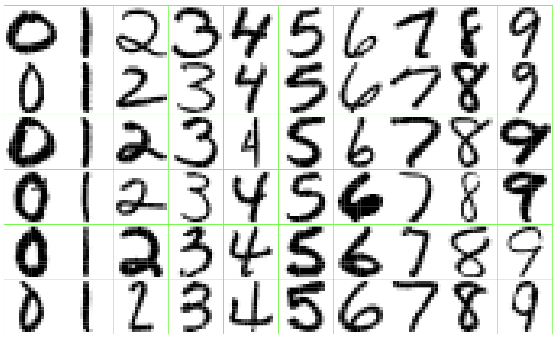
Zip Code
Identify the numbers in a handwritten zip code.
Netflix Prize

Video: Winning the Netflix Prize
Supervised Learning
Starting point
Outcome measurement \(Y\) (also called dependent variable, response, target).
Vector of \(p\) predictor measurements \(X\) (also called inputs, regressors, covariates, features, independent variables).
In the regression problem, \(Y\) is quantitative (e.g., price, blood pressure).
In the classification problem, \(Y\) takes values in a finite, unordered set (e.g., survived/died, digit 0–9, cancer class of tissue sample).
We have training data \((x_1, y_1), \ldots, (x_N, y_N)\). These are observations (examples, instances) of these measurements.
Objectives
On the basis of the training data, we would like to:
Accurately predict unseen test cases.
Understand which inputs affect the outcome, and how.
Assess the quality of our predictions and inferences.
Philosophy
It is important to understand the ideas behind the various techniques, in order to know how and when to use them.
We wil understand the simpler methods first to grasp the more sophisticated ones later.
It is important to accurately assess the performance of a method, to know how well or how badly it is working.
Unsupervised Learning
Unsupervised Learning
No outcome variable, just a set of predictors (features) measured on a set of samples.
Objective is more fuzzy:
Find groups of samples that behave similarly.
Find features that behave similarly.
Find linear combinations of features with the most variation.
Difficult to know how well we are doing.
Different from supervised learning, but can be useful as a pre-processing step for supervised learning.
Statistical Learning Overview
What is Statistical Learning?
What is Statistical Learning?
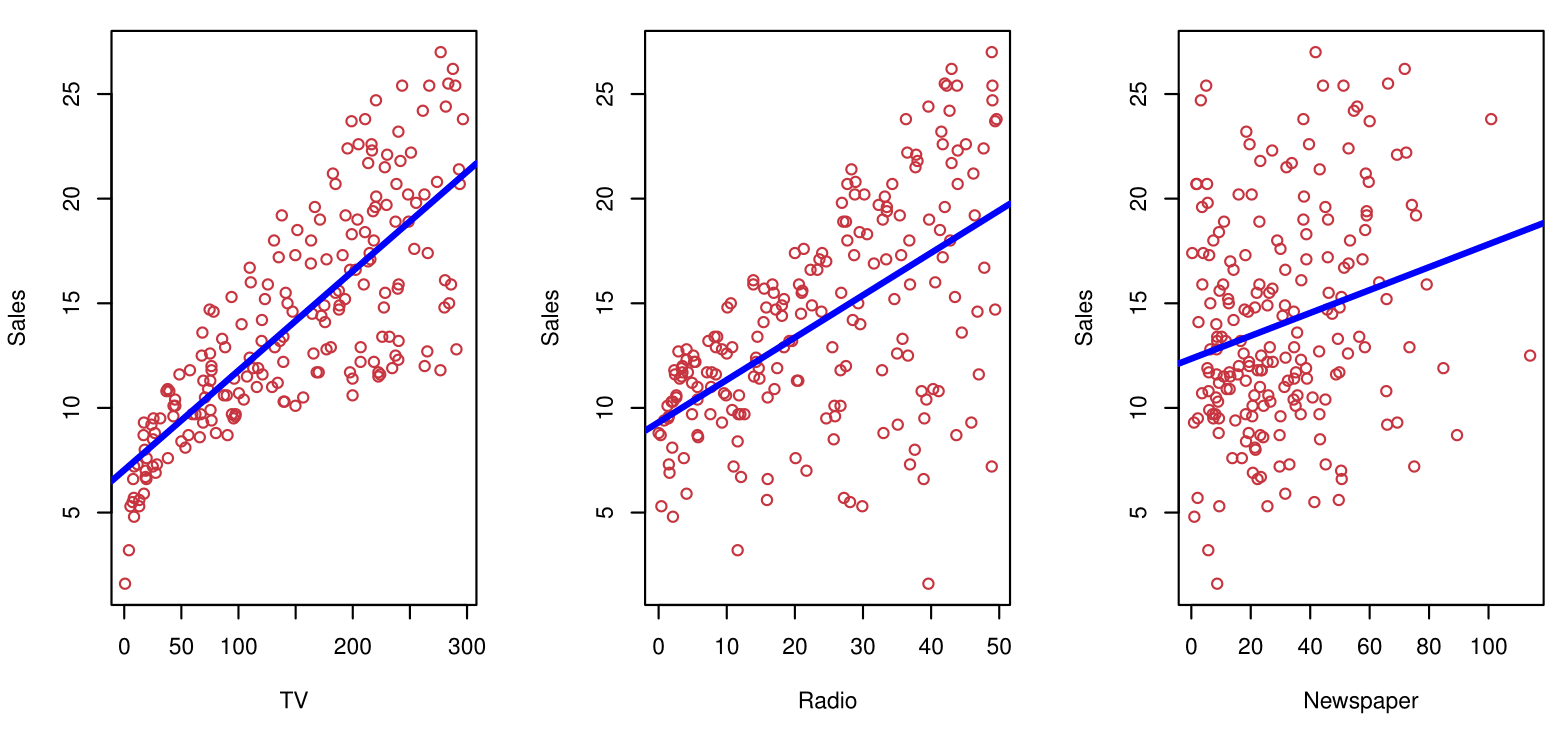
Shown are Sales vs TV, Radio, and Newspaper, with a blue linear-regression line fit separately to each.
Can we predict Sales using these three?
Perhaps we can do better using a model:
\[ \text{Sales} \approx f(\text{TV}, \text{Radio}, \text{Newspaper}) \]
Notation
Sales is a response or target that we wish to predict. We generically refer to the response as \(Y\).
TV is a feature, or input, or predictor; we name it \(X_1\).
Likewise, name Radio as \(X_2\), and so on.The input vector collectively is referred to as:
\[ X = \begin{pmatrix} X_1 \\ X_2 \\ X_3 \end{pmatrix} \]
We write our model as:
\[ Y = f(X) + \epsilon \]
where \(\epsilon\) captures measurement errors and other discrepancies.
What is \(f(X)\) Good For?
With a good \(f\), we can make predictions of \(Y\) at new points \(X = x\).
Understand which components of \(X = (X_1, X_2, \ldots, X_p)\) are important in explaining \(Y\), and which are irrelevant.
- Example: Seniority and Years of Education have a big impact on Income, but Marital Status typically does not.
Depending on the complexity of \(f\), understand how each component \(X_j\) affects \(Y\).
Is There an Ideal \(f(X)\)?
In particular, what is a good value for \(f(X)\) at a selected value of \(X\), say \(X = 4\)?
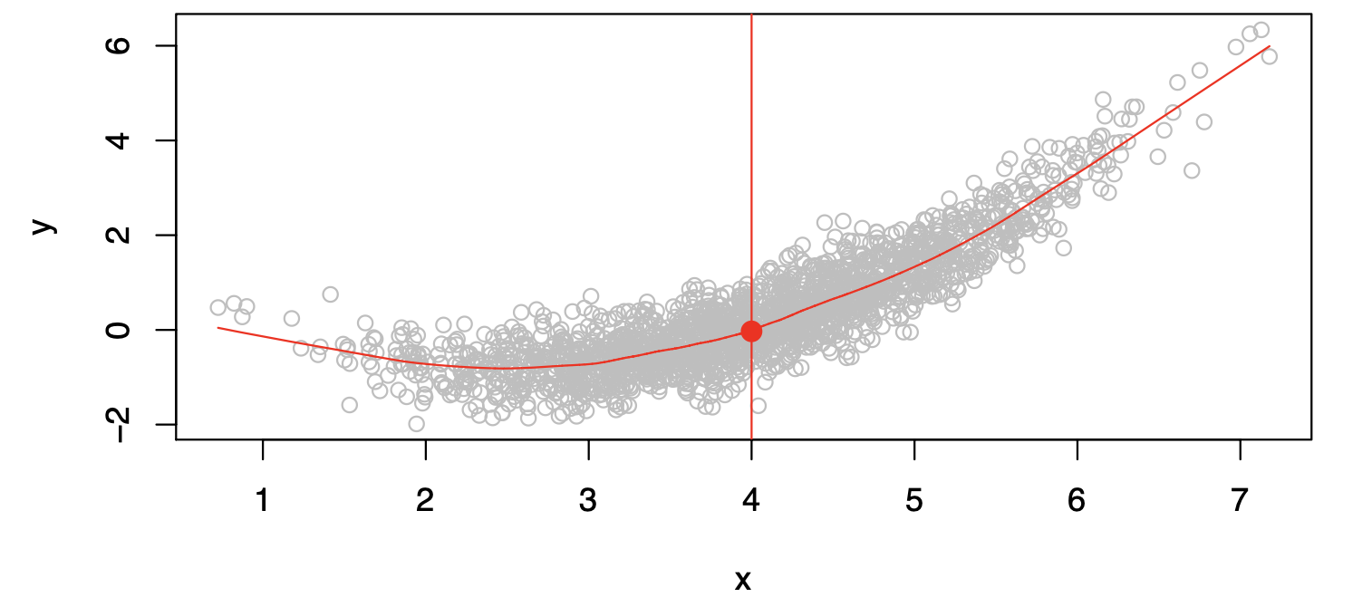
There can be many \(Y\) values at \(X=4\). A good value is:
\[ f(4) = E(Y|X=4) \]
where \(E(Y|X=4)\) means the expected value (average) of \(Y\) given \(X=4\).
This ideal \(f(x) = E(Y|X=x)\) is called the regression function.
The Regression Function \(f(x)\)
- Is also defined for a vector \(\mathbf{X}\).
\[ f(\mathbf{x}) = f(x_1, x_2, x_3) = \mathbb{E}[\,Y \mid X_1 = x_1,\, X_2 = x_2,\, X_3 = x_3\,]. \]
- Is the ideal or optimal predictor of \(Y\) in terms of mean-squared prediction error:
\[ f(x) = \mathbb{E}[Y \mid X = x] \quad\text{is the function that minimizes}\quad \mathbb{E}[(Y - g(X))^2 \mid X = x] \text{ over all } g \text{ and for all points } X = x. \]
\(\varepsilon = Y - f(x)\) is the irreducible error.
- Even if we knew \(f(x)\), we would still make prediction errors because at each \(X = x\) there is a distribution of possible \(Y\) values.
- For any estimate \(\hat{f}(x)\) of \(f(x)\),
\[ \mathbb{E}\bigl[(Y - \hat{f}(X))^2 \mid X = x\bigr] = \underbrace{[\,f(x) - \hat{f}(x)\,]^2}_{\text{Reducible}} \;+\; \underbrace{\mathrm{Var}(\varepsilon)}_{\text{Irreducible}}. \]
How to Estimate \(f\)
Often, we lack sufficient data points for exact computation of \(E(Y|X=x)\).
So, we relax the definition:
\[ \hat{f}(x) = \text{Ave}(Y|X \in \mathcal{N}(x)) \]
where \(\mathcal{N}(x)\) is a neighborhood of \(x\).
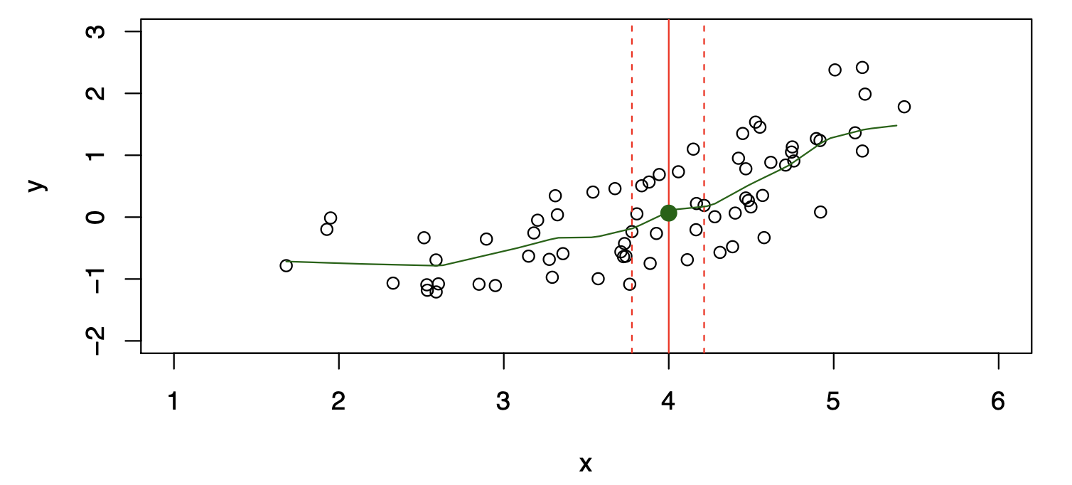
Nearest Neighbor Observations
Nearest neighbor averaging can be pretty good for small \(p\) — i.e., \(p \le 4\) — and large-ish \(N\).
We will discuss smoother versions, such as kernel and spline smoothing, later in the course.
Nearest neighbor methods can be lousy when \(p\) is large.
Reason: the curse of dimensionality. Nearest neighbors tend to be far away in high dimensions.
We need to get a reasonable fraction of the \(N\) values of \(y_i\) to average in order to bring the variance down (e.g., 10%).
A 10% neighborhood in high dimensions is no longer truly local, so we lose the spirit of estimating \(\mathbb{E}[Y \mid X = x]\) via local averaging.
The curse of dimensionality
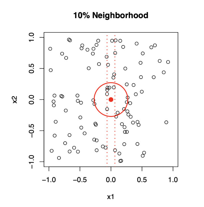
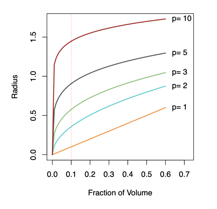
Top panel: \(X_1\) and \(X_2\) are uniformly distributed with edges minus one to plus one.
1-Dimensional Neighborhood
- Focuses only on \(X_1\), ignoring \(X_2\).
- Neighborhood is defined by vertical red dotted lines.
- Centered on the target point \((0, 0)\).
- Extends symmetrically along \(X_1\) until it captures 10% of the data points.
2-Dimensional Neighborhood
- Now, Considers both \(X_1\) and \(X_2\).
- Neighborhood is a circular region centered on the same target point \((0, 0)\).
- Radius of the circle expands until it encloses 10% of the total data points.
- The radius in 2D is much larger than the 1D width due to the need to account for more dimensions.
Botton panel: We see how far we have to go out in one, two, three, five, and ten dimensions in order to capture a certain fraction of the points.
Key Takeaway: As dimensionality increases, neighborhoods must expand significantly to capture the same fraction of data points, illustrating the curse of dimensionality.
Parametric and Structured Models
Parametric and Structured Models
The linear model is a key example of a parametric model to deal with the curse of dimensionality:
\[ f_L(X) = \beta_0 + \beta_1X_1 + \beta_2X_2 + \ldots + \beta_pX_p \]
A linear model is specified in terms of \(p+1\) parameters (\(\beta_0, \beta_1, \ldots, \beta_p\)).
We estimate the parameters by fitting the model to training data.
Although it is almost never correct, it serves as a good and interpretable approximation to the unknown true function \(f(X)\).
Comparison of Models
\[ \hat{f}_L(X) = \hat{\beta}_0 + \hat{\beta}_1X \]
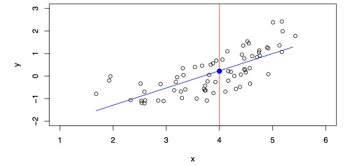
The linear model gives a reasonable fit here.
\[ \hat{f}_Q(X) = \hat{\beta}_0 + \hat{\beta}_1X + \hat{\beta}_2X^2 \]
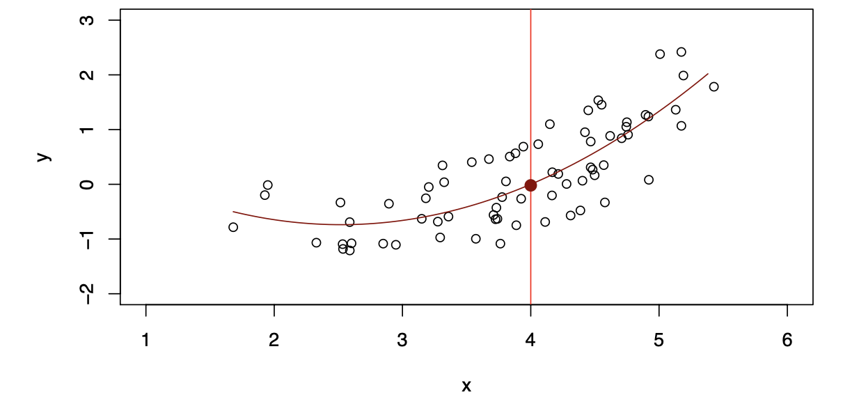
Quadratic models may fit slightly better than linear models in some cases.
Simulated Example
Red points are simulated values for income from the model:
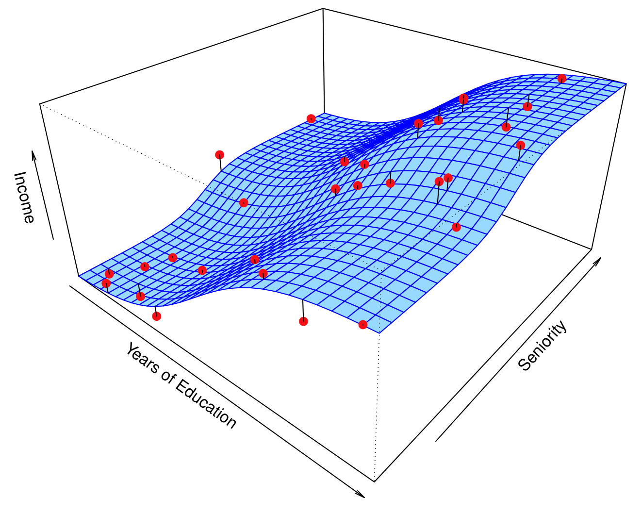
\[ \text{income} = f(\text{education}, \text{seniority}) + \epsilon \]
\(f\) is the blue surface.
Linear Regression Fit
Linear regression model fit to the simulated data:
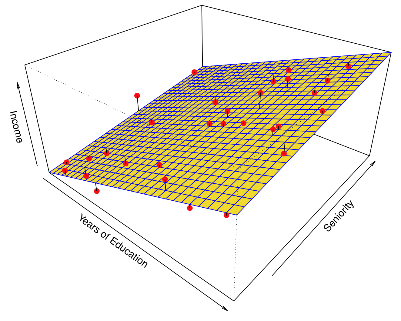
\[ \hat{f}_L(\text{education}, \text{seniority}) = \hat{\beta}_0 + \hat{\beta}_1 \times \text{education} + \hat{\beta}_2 \times \text{seniority} \]
Flexible Regression Model Fit
More flexible regression model \(\hat{f}_S(\text{education}, \text{seniority})\) fit to the simulated data.
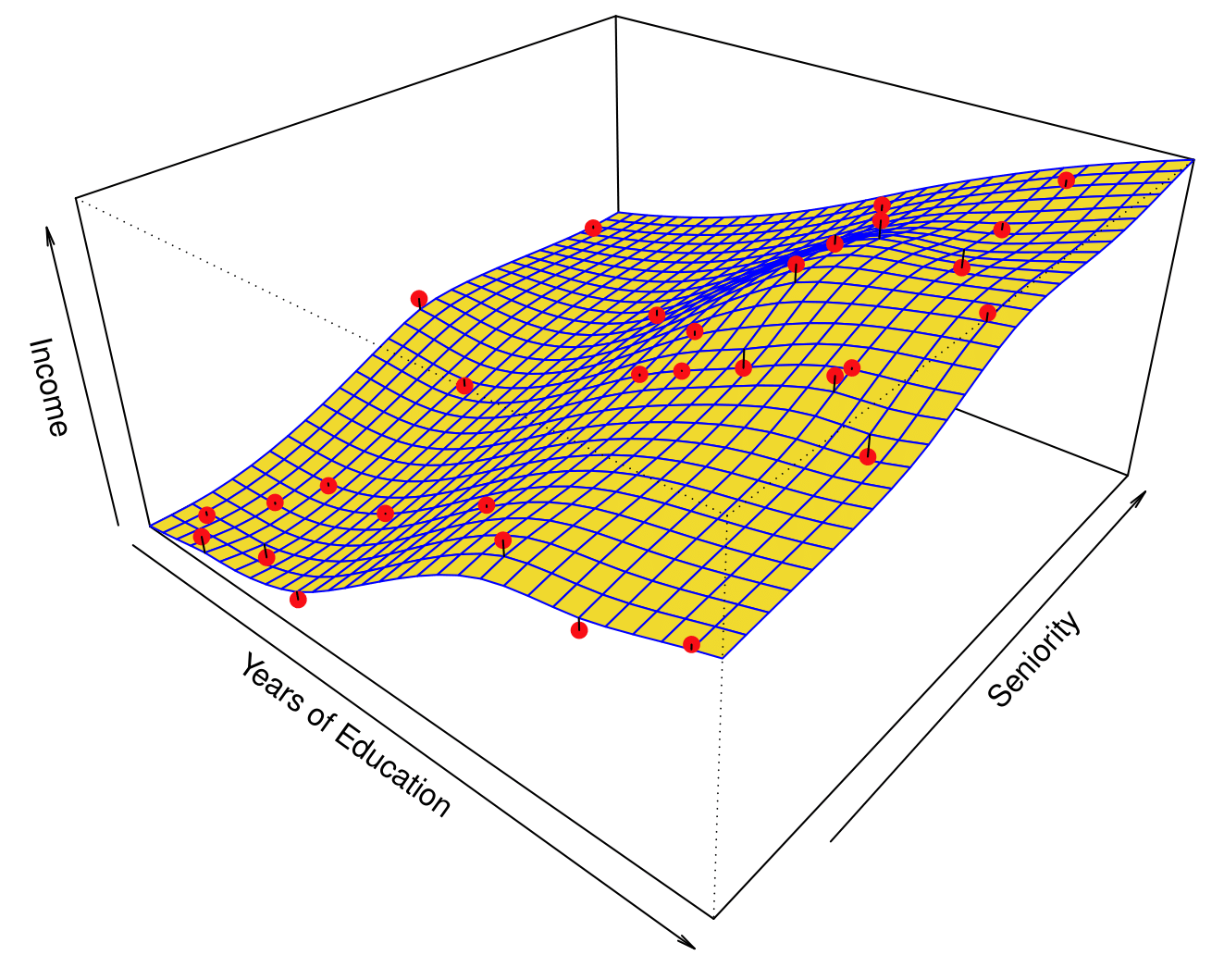
Here we use a technique called a thin-plate spline to fit a flexible surface. We control the roughness of the fit.
Overfitting
Even more flexible spline regression model \(\hat{f}_S(\text{education}, \text{seniority})\) fit to the simulated data. We tunned the parameter all the way down to zero and this surface actually goes through every single data point.
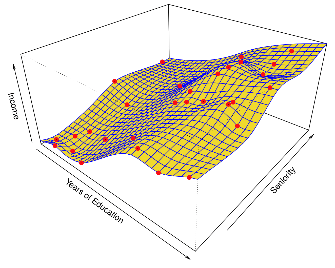
The fitted model makes no errors on the training data! This is known as overfitting.
Some Trade-offs
Prediction accuracy versus interpretability:
- Linear models are easy to interpret; thin-plate splines are not.
Good fit versus over-fit or under-fit:
- How do we know when the fit is just right?
Parsimony versus black-box:
- Prefer simpler models involving fewer variables over black-box predictors.
Flexibility vs. Interpretability
Trade-offs between flexibility and interpretability:
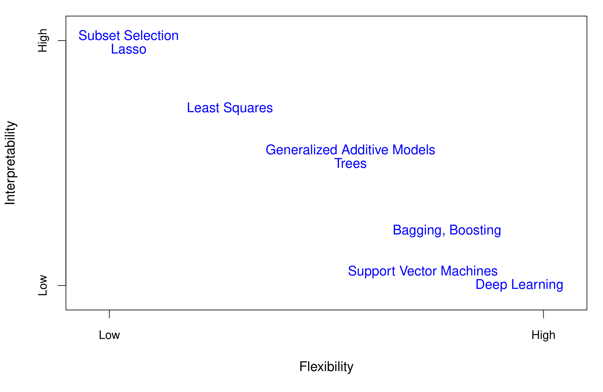
- High interpretability: Subset selection, Lasso.
- Intermediate: Least squares, Generalized Additive Models, Trees.
- High flexibility: Support Vector Machines, Deep Learning.
Assessing Model Accuracy
Assessing Model Accuracy
Suppose we fit a model \(\hat{f}(x)\) to some training data \(Tr = \{x_i, y_i\}_{i=1}^N\), and we wish to evaluate its performance:
- Compute the average squared prediction error over the training set \(Tr\), the Mean Squared Error (MSE):
\[ \text{MSE}_{Tr} = \text{Ave}_{i \in Tr}[(y_i - \hat{f}(x_i))^2] \]
However, this may be biased toward more overfit models.
- Instead, use fresh test data \(Te = \{x_i, y_i\}_{i=1}^M\):
\[ \text{MSE}_{Te} = \text{Ave}_{i \in Te}[(y_i - \hat{f}(x_i))^2] \]
Bias-Variance Trade-off
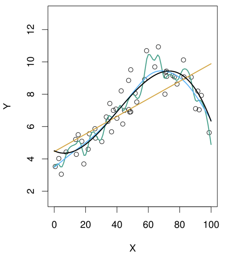
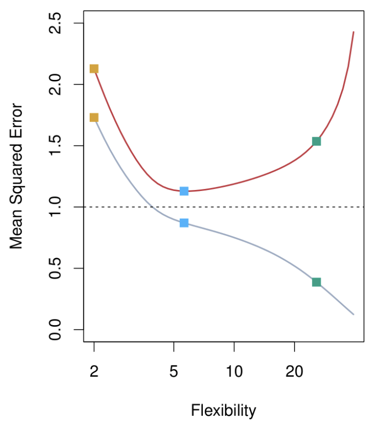
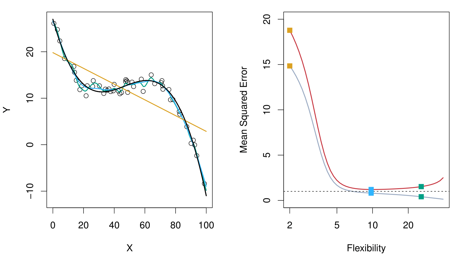
Top Panel: Model Fits
Black Curve: The true generating function, representing the underlying relationship we want to estimate.
Data Points: Observations generated from the black curve, with added noise (error).
Fitted Models:
- Orange Line: A simple linear model (low flexibility).
- Blue Line: A moderately flexible model, likely a spline or thin plate spline.
- Green Line: A highly flexible model that closely fits the data points but may overfit.
Key Insight:
The green model captures the data points well but risks overfitting, while the orange model is too rigid and misses the underlying structure. The blue model strikes a balance.
Botton Panel: Mean Squared Error (MSE)
Gray Curve: Training data MSE.
- Decreases consistently as flexibility increases.
- Flexible models fit the training data well, but this does not generalize to test data.
Red Curve: Test data MSE across models of increasing flexibility.
- Starts high for rigid models (orange line).
- Decreases to a minimum (optimal model complexity, blue line).
- Increases again for overly flexible models (green line), due to overfitting.
Key Takeaway:
There is an optimal model complexity (the “magic point”) where test data MSE is minimized. Beyond this point, models become overly complex and generalization performance deteriorates.
Bias-Variance Trade-off: Other Examples
Here, the truth is smoother, so smoother fits and linear models perform well.
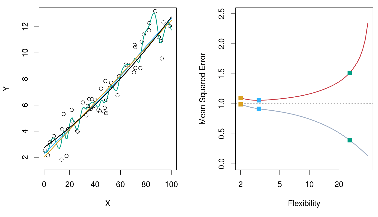
Here, the truth is wiggly and the noise is low. More flexible fits perform the best.
Bias-Variance Trade-off
Suppose we have fit a model \(\hat{f}(x)\) to some training data \(\text{Tr}\), and let \((x_0, y_0)\) be a test observation drawn from the population.
If the true model is
\[ Y = f(X) + \varepsilon \quad \text{(with } f(x) = \mathbb{E}[Y \mid X = x]\text{)}, \]
then
\[ \mathbb{E}\Bigl[\bigl(y_0 - \hat{f}(x_0)\bigr)^2\Bigr] = \mathrm{Var}\bigl(\hat{f}(x_0)\bigr) + \bigl[\mathrm{Bias}\bigl(\hat{f}(x_0)\bigr)\bigr]^2 + \mathrm{Var}(\varepsilon). \]
The expectation averages over the variability of \(y_0\) as well as the variability in \(\text{Tr}\). Note that
\[ \mathrm{Bias}\bigl(\hat{f}(x_0)\bigr) = \mathbb{E}[\hat{f}(x_0)] - f(x_0). \]
Typically, as the flexibility of \(\hat{f}\) increases, its variance increases and its bias decreases. Hence, choosing the flexibility based on average test error amounts to a bias-variance trade-off.
Bias-Variance Trade-off of the Examples
Below is a schematic illustration of the mean squared error (MSE), bias, and variance curves as a function of the model’s flexibility.
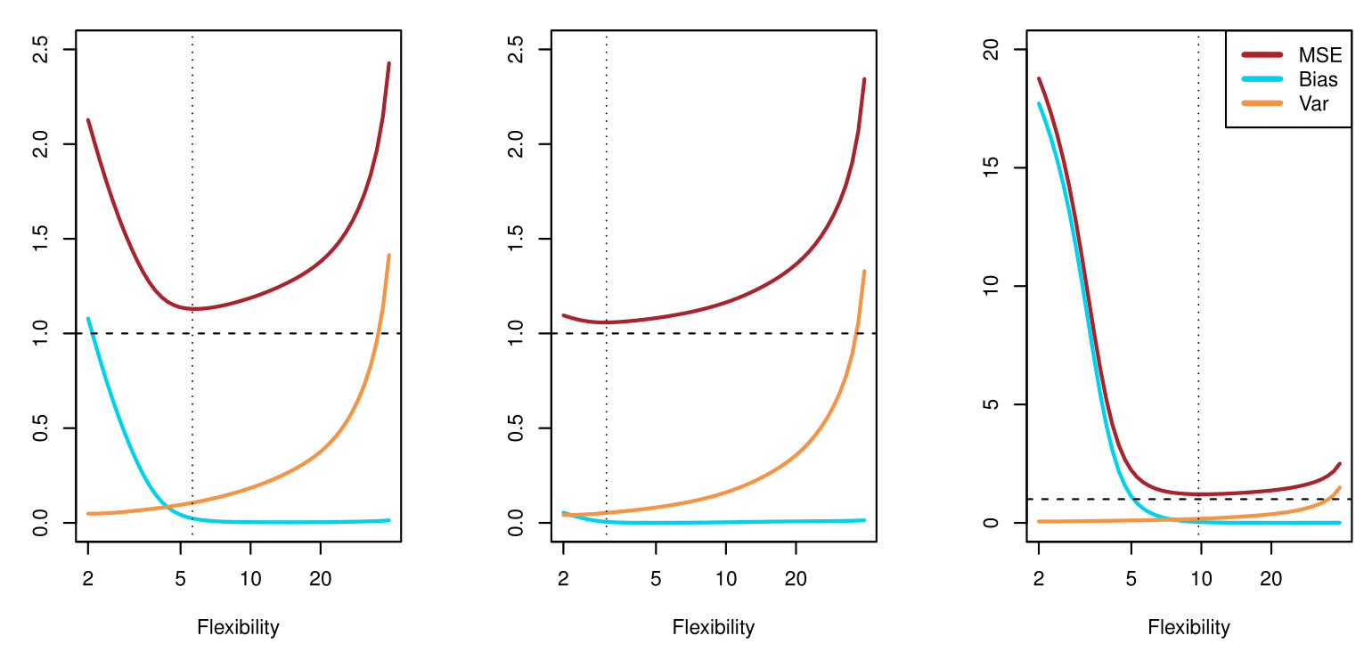
MSE (red curve) goes down initially (as the model becomes more flexible) but eventually goes up (as overfitting sets in).
Bias (blue/teal curve) decreases with increasing flexibility.
Variance (orange curve) increases with increasing flexibility.
The vertical dotted line in each panel suggests a model flexibility that balances both bias and variance in an “optimal” region for minimizing MSE.
Classification Problems
Classification Problems
Here the response variable \(Y\) is qualitative. For example:
Email could be classified as spam or ham (good email).
Digit classification could be one of \(\{0, 1, 2, \dots, 9\}\).
Our goals are to:
Build a classifier \(C(X)\) that assigns a class label from the set \(C\) to a future unlabeled observation \(X\).
Assess the uncertainty in each classification.
Understand the roles of the different predictors among \(X = (X_1, X_2, \dots, X_p)\).
Ideal Classifier and Bayes Decision Rule
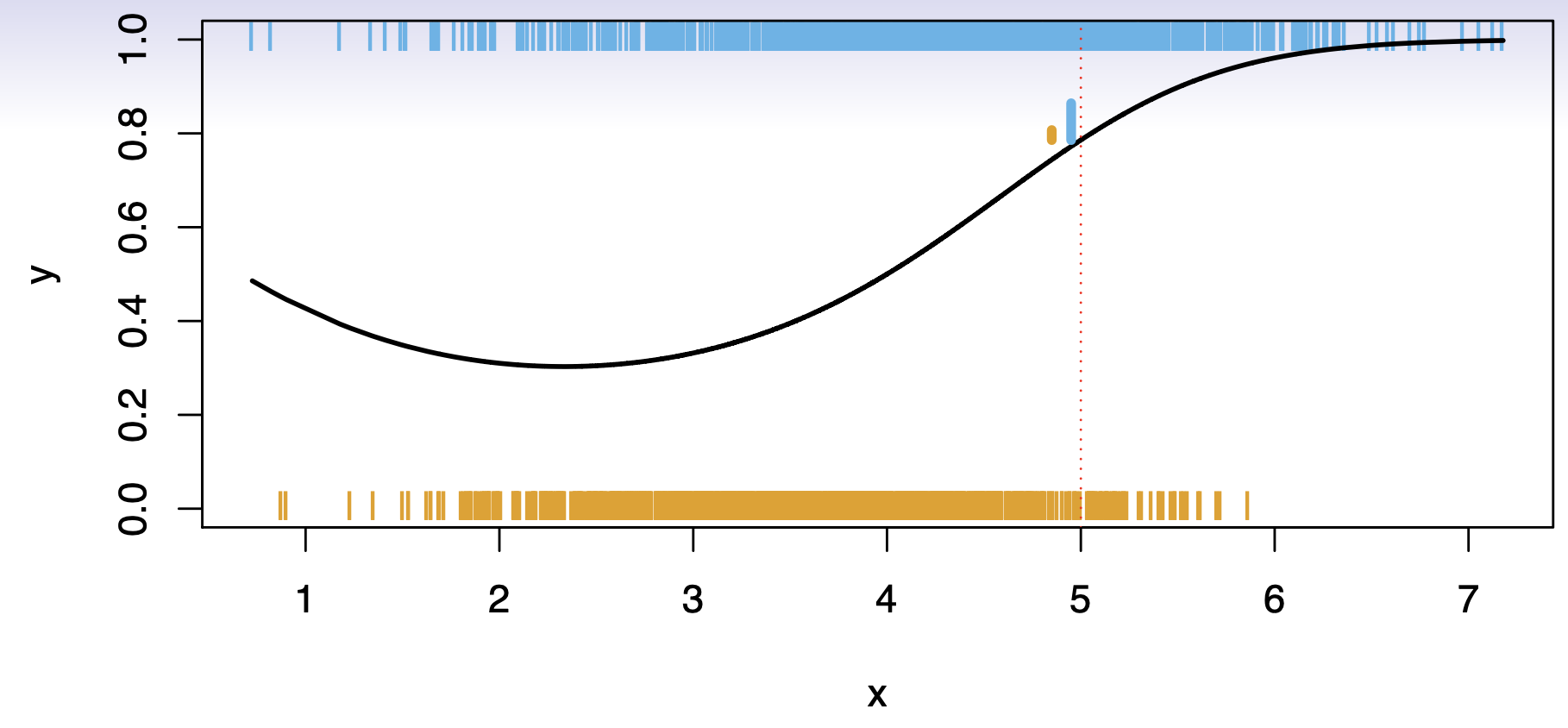
Consider a classification problem with \(K\) possible classes, numbered \(1, 2, \ldots, K\). Define
\[ p_k(x) = \Pr(Y = k \mid X = x), \quad k = 1, 2, \ldots, K. \]
These are the conditional class probabilities at \(x\); e.g. see little barplot at \(x=5\).
The Bayes optimal classifier at \(x\) is
\[ C(x) \;=\; j \quad \text{if} \quad p_j(x) = \max \{\,p_1(x),\, p_2(x),\, \dots,\, p_K(x)\}. \]
Nearest-Neighbor Averaging
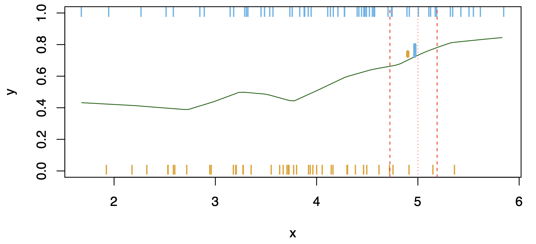
Nearest-neighbor averaging can be used as before.
Also breaks down as dimension grows. However, the impact on \(\hat{C}(x)\)is less than on \(\hat{p}_k(x)\), for \(k = 1,\ldots,K\).
Classification: Some Details
Typically we measure the performance of \(\hat{C}(x)\) using the misclassification error rate:
\[ \mathrm{Err}_{\mathrm{Te}} = \mathrm{Ave}_{i\in \mathrm{Te}} \bigl[I(y_i \neq \hat{C}(x_i))\bigr]. \]
The Bayes classifier (using the true \(p_k(x)\)) has the smallest error in the population.
Support-vector machines build structured models for \(\hat{C}(x)\).
We also build structured models for representing \(p_k(x)\). For example, logistic regression or generalized additive models.
Example: K-Nearest Neighbors in Two Dimensions
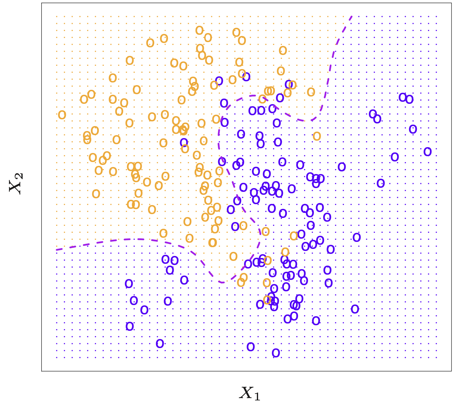
Below is an example data set in two dimensions \((X_1, X_2)\). Points shown in blue might represent one class, and points in orange the other. The dashed boundary suggests a decision boundary formed by a classifier.
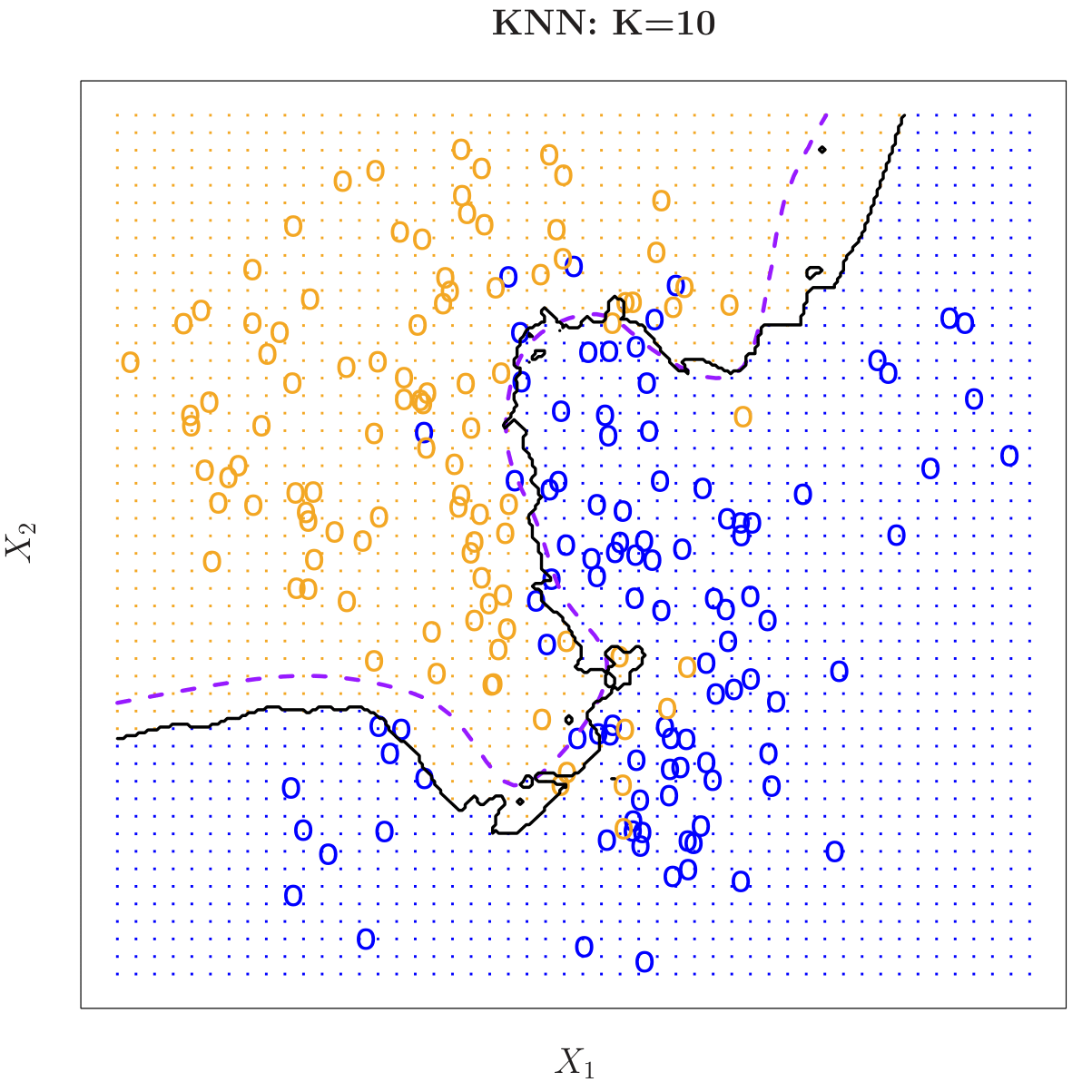
KNN: K = 10
Here is the same data set classified by k-nearest neighbors with \(k = 10\). The black boundary line encloses the region of the feature space predicted as orange vs. blue, showing how the decision boundary has become smoother.
KNN: K = 1 vs. K = 100
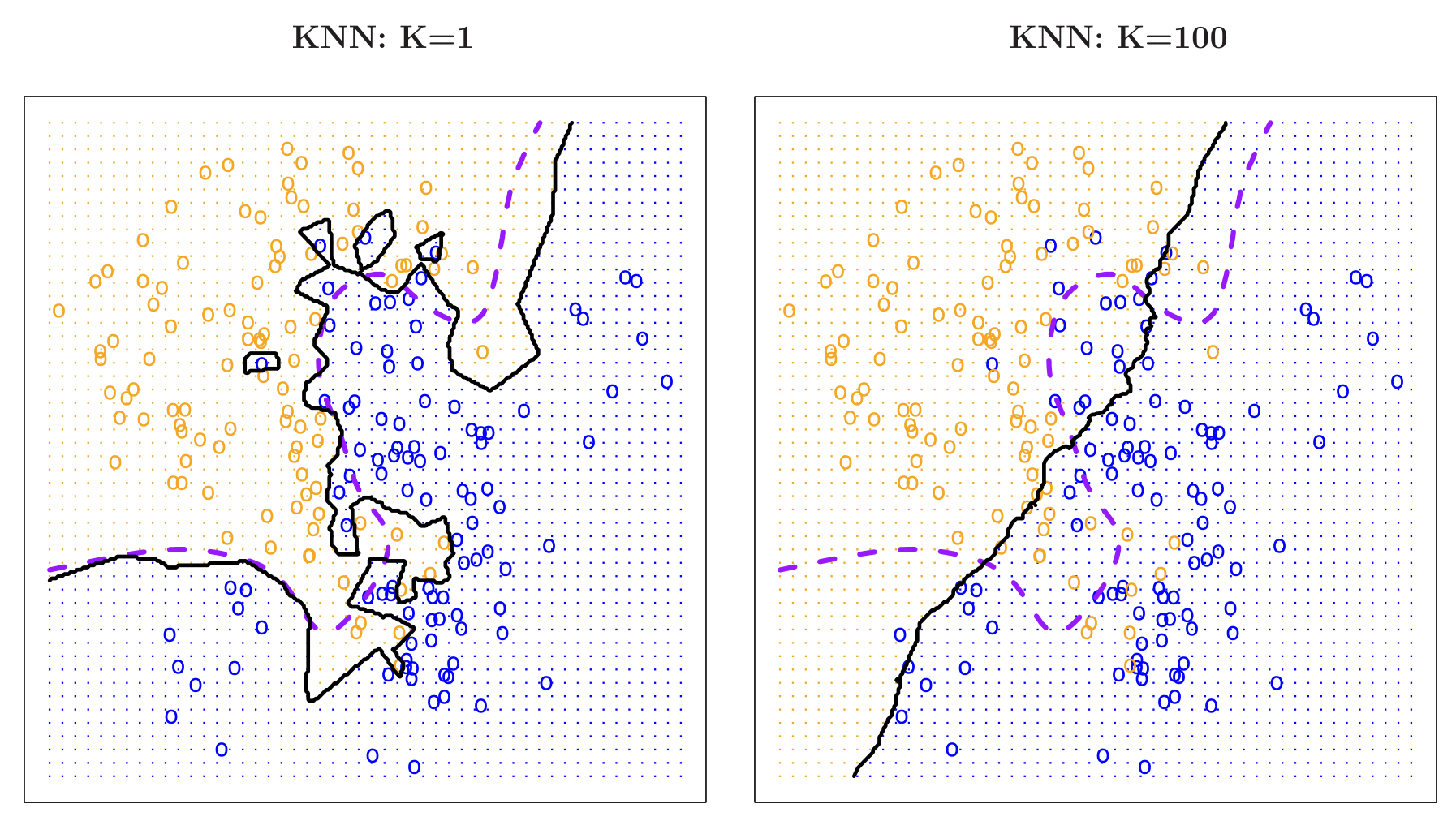
Comparisons of a very low value of \(k\) (left, \(k=1\)) versus a very high value (right, \(k=100\)).
\(k=1\): Overly flexible boundary that can overfit.
\(k=100\): Very smooth boundary that can underfit.
KNN Error Rates
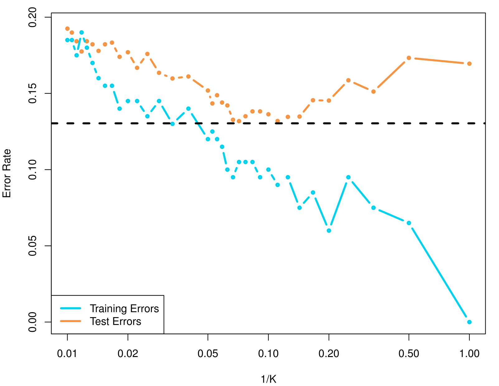
The figure illustrates how training errors (blue curve) and test errors (orange curve) change for a K-nearest neighbors (KNN) classifier as \(\frac{1}{K}\) varies.
For small \(K\) (i.e., large \(\frac{1}{K}\)), the model can become very flexible, often driving down training error but increasing overfitting and thus test error.
For large \(K\) (i.e., small \(\frac{1}{K}\)), the model becomes smoother, which can help avoid overfitting but sometimes leads to underfitting.
The dashed horizontal line is the bayes error, used as reference for comparison.
Summary
Summary
Statistical Learning and Predictive Analytics
Goal: Build models to predict outcomes and understand relationships between inputs (predictors) and responses.
Supervised Learning: Focuses on predicting \(Y\) (response) using \(X\) (predictors) via models like regression and classification.
Unsupervised Learning: Focuses on finding patterns in data without predefined responses (e.g., clustering).
Bias-Variance Trade-off
Key Trade-off: Model flexibility affects bias and variance:
- High flexibility → Low bias but high variance (overfitting).
- Low flexibility → High bias but low variance (underfitting).
Goal: Find the optimal flexibility that minimizes test error.
Techniques and Applications
Parametric Models:
- Simpler and interpretable (e.g., linear regression).
- Often used as approximations.
Flexible Models:
- Handle complex patterns (e.g., splines, SVMs, deep learning).
- Require careful tuning to avoid overfitting.
Practical Considerations
Assessing Model Accuracy:
- Use test data to calculate MSE.
- Balance between training performance and generalizability.
Key Challenges
Curse of Dimensionality:
- High-dimensional data affects distance-based methods like KNN.
- Larger neighborhoods needed, losing “locality.”
Thank you!
Predictive Analytics