
MGMT 47400: Predictive Analytics
Syllabus, Logistics, and Introduction
Instructor’s Passions
![]()

Instructor’s Passions

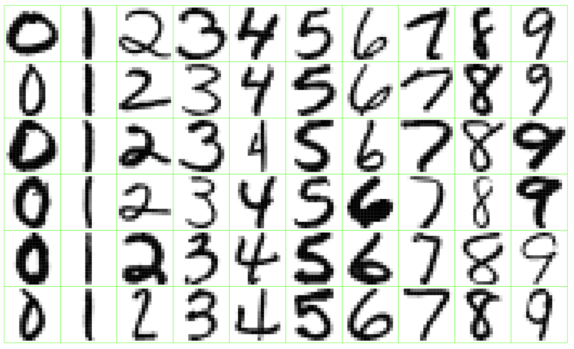
Zip Code
Identify the numbers in a handwritten zip code.
Netflix Prize

Video: Winning the Netflix Prize
What is Statistical Learning?
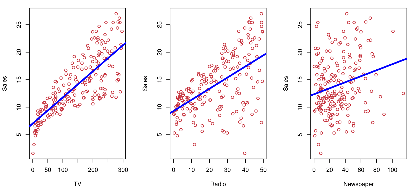
Shown are Sales vs TV, Radio, and Newspaper, with a blue linear-regression line fit separately to each.
Can we predict Sales using these three?
Perhaps we can do better using a model:
\[ \text{Sales} \approx f(\text{TV}, \text{Radio}, \text{Newspaper}) \]
Is There an Ideal \(f(X)\)?
In particular, what is a good value for \(f(X)\) at a selected value of \(X\), say \(X = 4\)?
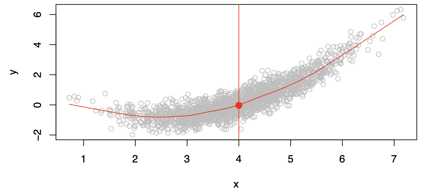
There can be many \(Y\) values at \(X=4\). A good value is:
\[ f(4) = E(Y|X=4) \]
where \(E(Y|X=4)\) means the expected value (average) of \(Y\) given \(X=4\).
This ideal \(f(x) = E(Y|X=x)\) is called the regression function.
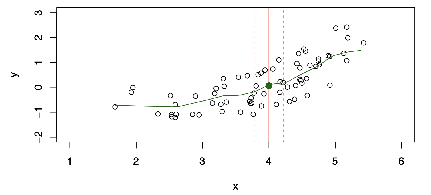
How to Estimate \(f\)
Often, we lack sufficient data points for exact computation of \(E(Y|X=x)\).
So, we relax the definition:
\[ \hat{f}(x) = \text{Ave}(Y|X \in \mathcal{N}(x)) \]
where \(\mathcal{N}(x)\) is a neighborhood of \(x\).
The curse of dimensionality
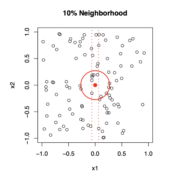
Top panel: \(X_1\) and \(X_2\) are uniformly distributed with edges minus one to plus one.
1-Dimensional Neighborhood
- Focuses only on \(X_1\), ignoring \(X_2\).
- Neighborhood is defined by vertical red dotted lines.
- Centered on the target point \((0, 0)\).
- Extends symmetrically along \(X_1\) until it captures 10% of the data points.
2-Dimensional Neighborhood
- Now, Considers both \(X_1\) and \(X_2\).
- Neighborhood is a circular region centered on the same target point \((0, 0)\).
- Radius of the circle expands until it encloses 10% of the total data points.
- The radius in 2D is much larger than the 1D width due to the need to account for more dimensions.
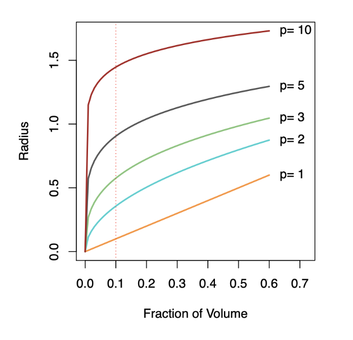
Bottom panel: We see how far we have to go out in one, two, three, five, and ten dimensions in order to capture a certain fraction of the points.
Key Takeaway: As dimensionality increases, neighborhoods must expand significantly to capture the same fraction of data points, illustrating the curse of dimensionality.
Comparison of Models
\[ \hat{f}_L(X) = \hat{\beta}_0 + \hat{\beta}_1X \]
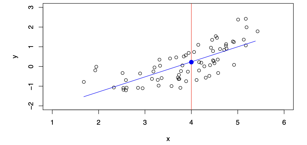
The linear model gives a reasonable fit here.
\[ \hat{f}_Q(X) = \hat{\beta}_0 + \hat{\beta}_1X + \hat{\beta}_2X^2 \]
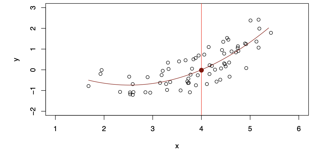
Quadratic models may fit slightly better than linear models in some cases.
Simulated Example
Red points are simulated values for income from the model:
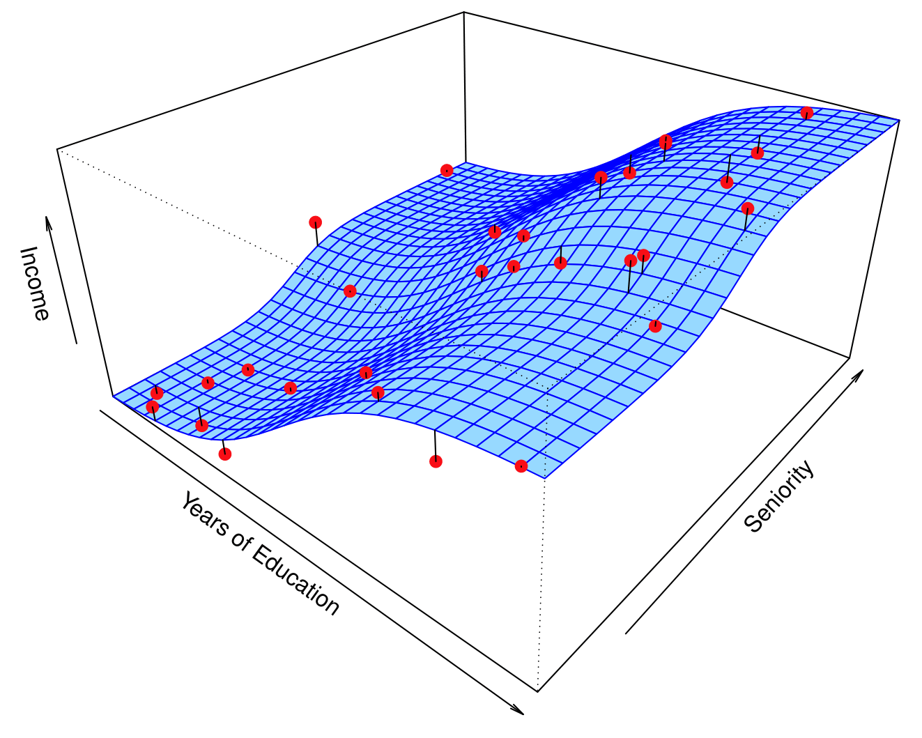
\[ \text{income} = f(\text{education}, \text{seniority}) + \epsilon \]
\(f\) is the blue surface.
Linear Regression Fit
Linear regression model fit to the simulated data:
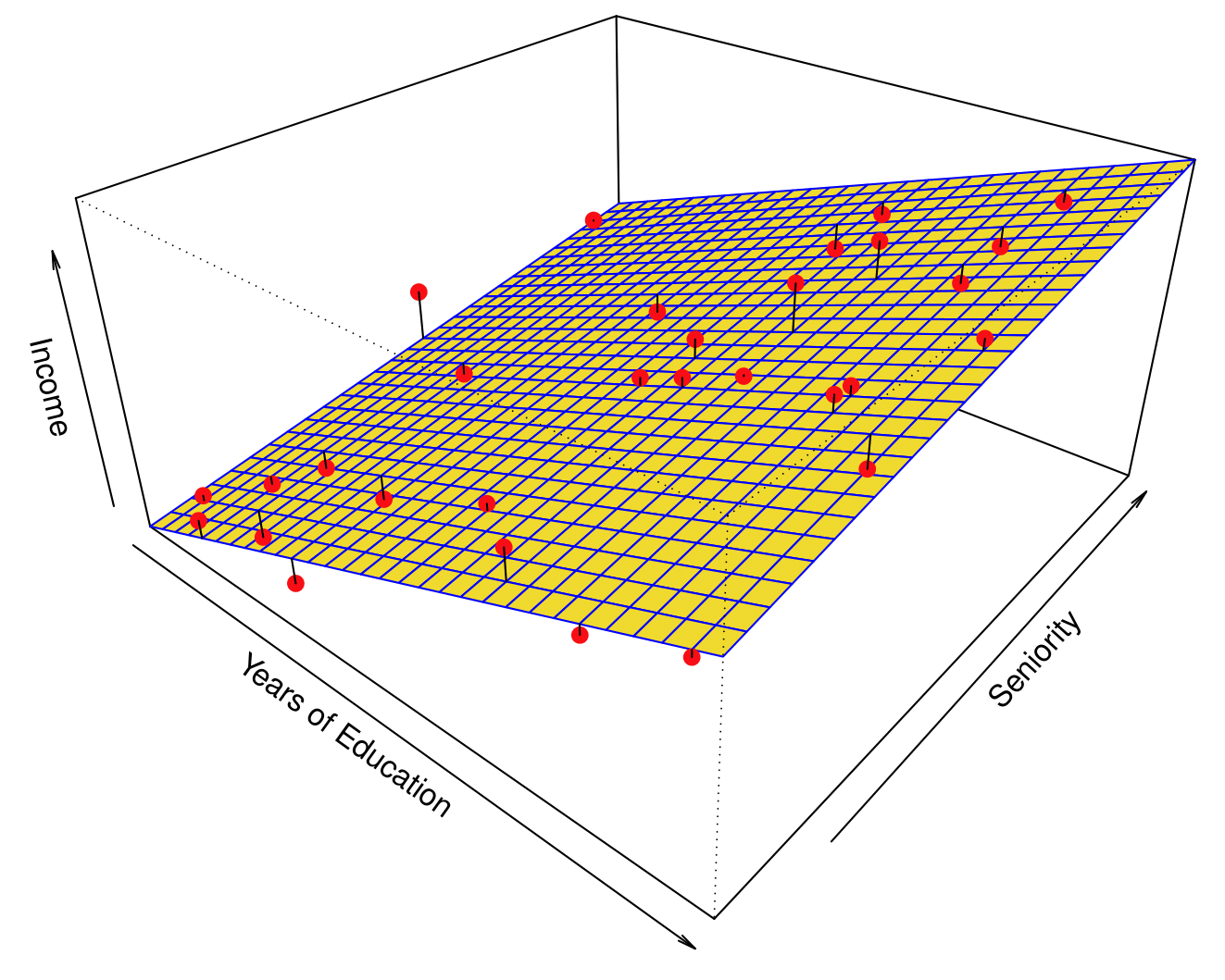
\[ \hat{f}_L(\text{education}, \text{seniority}) = \hat{\beta}_0 + \hat{\beta}_1 \times \text{education} + \hat{\beta}_2 \times \text{seniority} \]
Flexible Regression Model Fit
More flexible regression model \(\hat{f}_S(\text{education}, \text{seniority})\) fit to the simulated data.
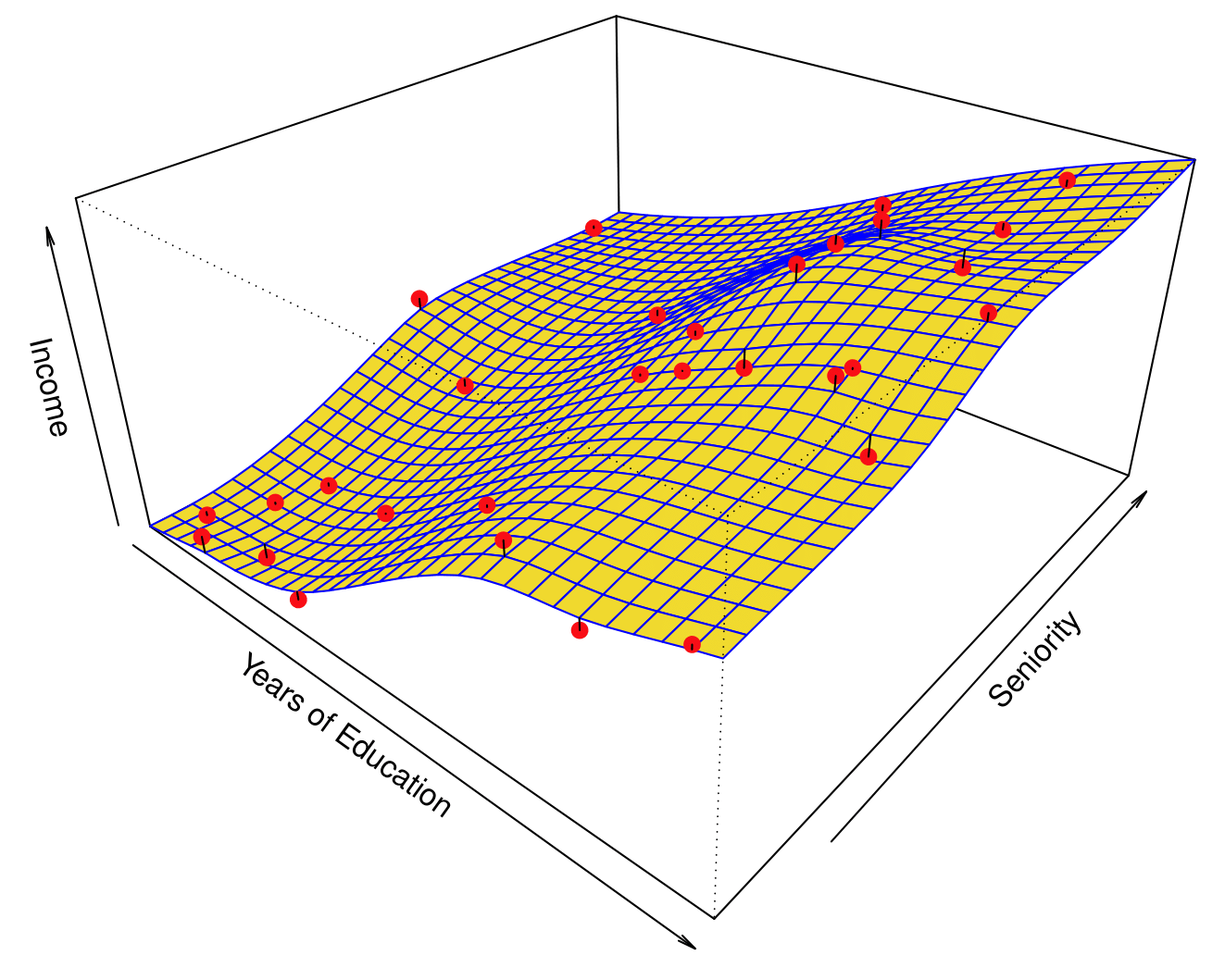
Here we use a technique called a thin-plate spline to fit a flexible surface. We control the roughness of the fit.
Overfitting
Even more flexible spline regression model \(\hat{f}_S(\text{education}, \text{seniority})\) fit to the simulated data. We tuned the parameter all the way down to zero and this surface actually goes through every single data point.
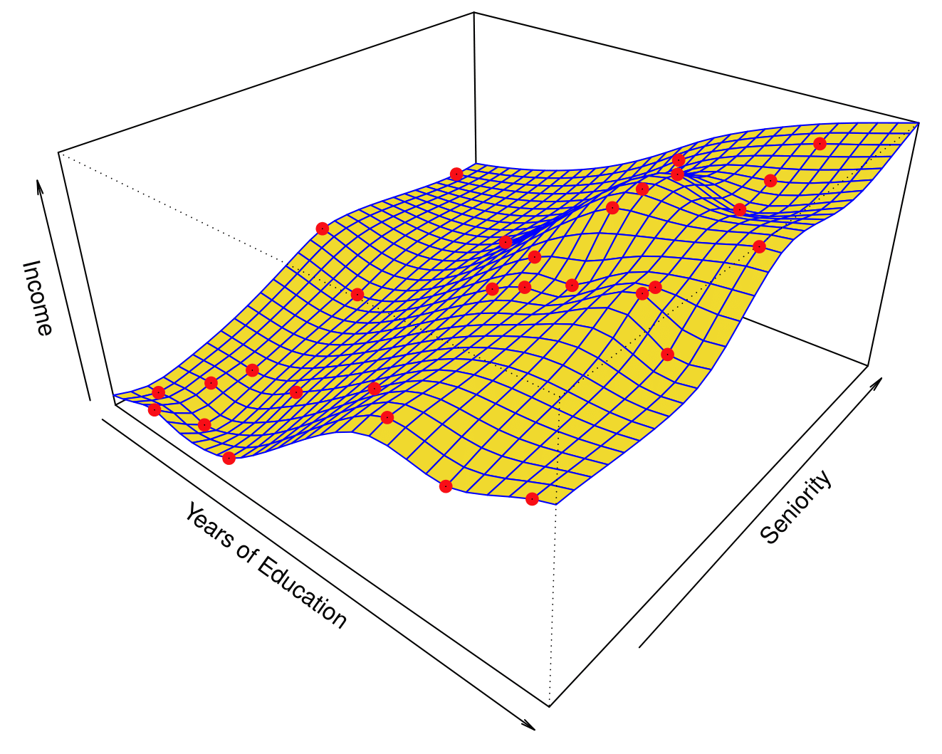
The fitted model makes no errors on the training data! This is known as overfitting.
Flexibility vs. Interpretability
Trade-offs between flexibility and interpretability:
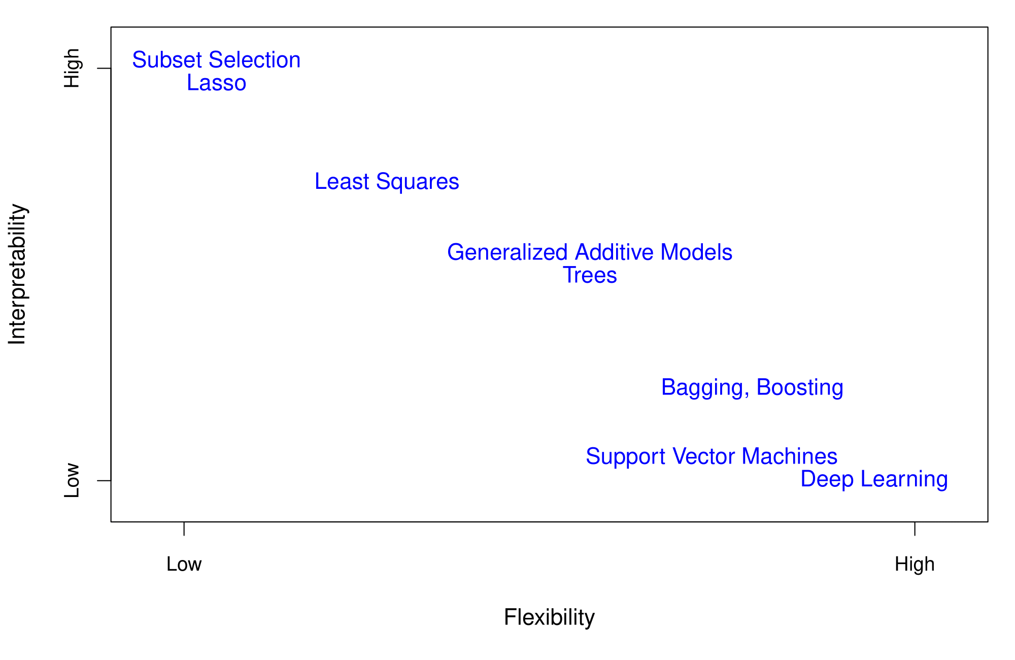
- High interpretability: Subset selection, Lasso.
- Intermediate: Least squares, Generalized Additive Models, Trees.
- High flexibility: Support Vector Machines, Deep Learning.
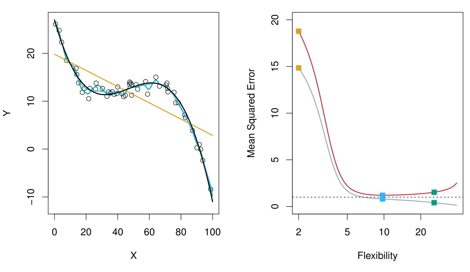
Bias-Variance Trade-off
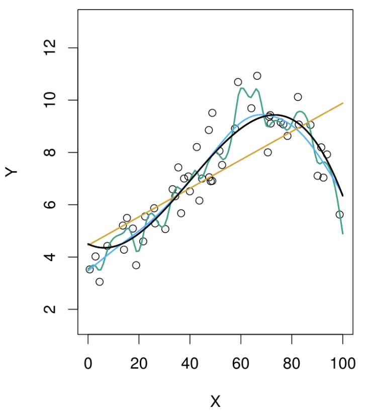
Top Panel: Model Fits
Black Curve: The true generating function, representing the underlying relationship we want to estimate.
Data Points: Observations generated from the black curve, with added noise (error).
Fitted Models:
- Orange Line: A simple linear model (low flexibility).
- Blue Line: A moderately flexible model, likely a spline or thin plate spline.
- Green Line: A highly flexible model that closely fits the data points but may overfit.
Key Insight:
The green model captures the data points well but risks overfitting, while the orange model is too rigid and misses the underlying structure. The blue model strikes a balance.
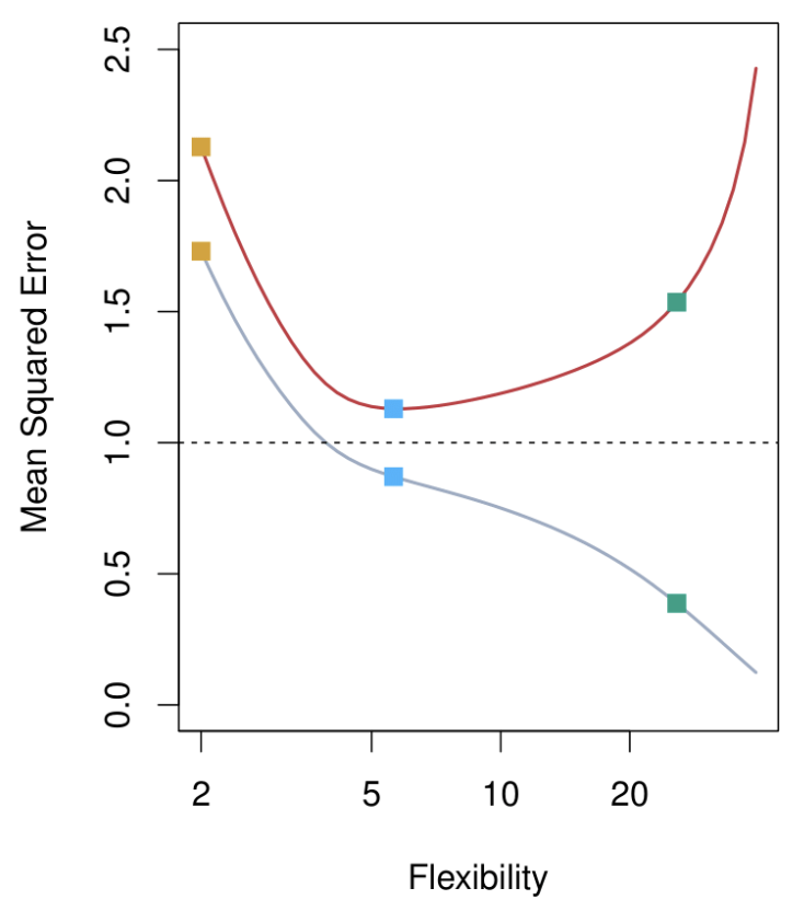
Bottom Panel: Mean Squared Error (MSE)
Gray Curve: Training data MSE.
- Decreases consistently as flexibility increases.
- Flexible models fit the training data well, but this does not generalize to test data.
Red Curve: Test data MSE across models of increasing flexibility.
- Starts high for rigid models (orange line).
- Decreases to a minimum (optimal model complexity, blue line).
- Increases again for overly flexible models (green line), due to overfitting.
Key Takeaway:
There is an optimal model complexity (the “magic point”) where test data MSE is minimized. Beyond this point, models become overly complex and generalization performance deteriorates.
Bias-Variance Trade-off: Other Examples
Here, the truth is smoother, so smoother fits and linear models perform well.
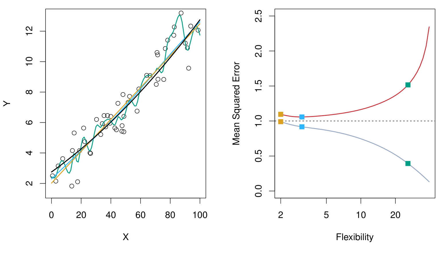
Here, the truth is wiggly and the noise is low. More flexible fits perform the best.
Bias-Variance Trade-off of the Examples
Below is a schematic illustration of the mean squared error (MSE), bias, and variance curves as a function of the model’s flexibility.
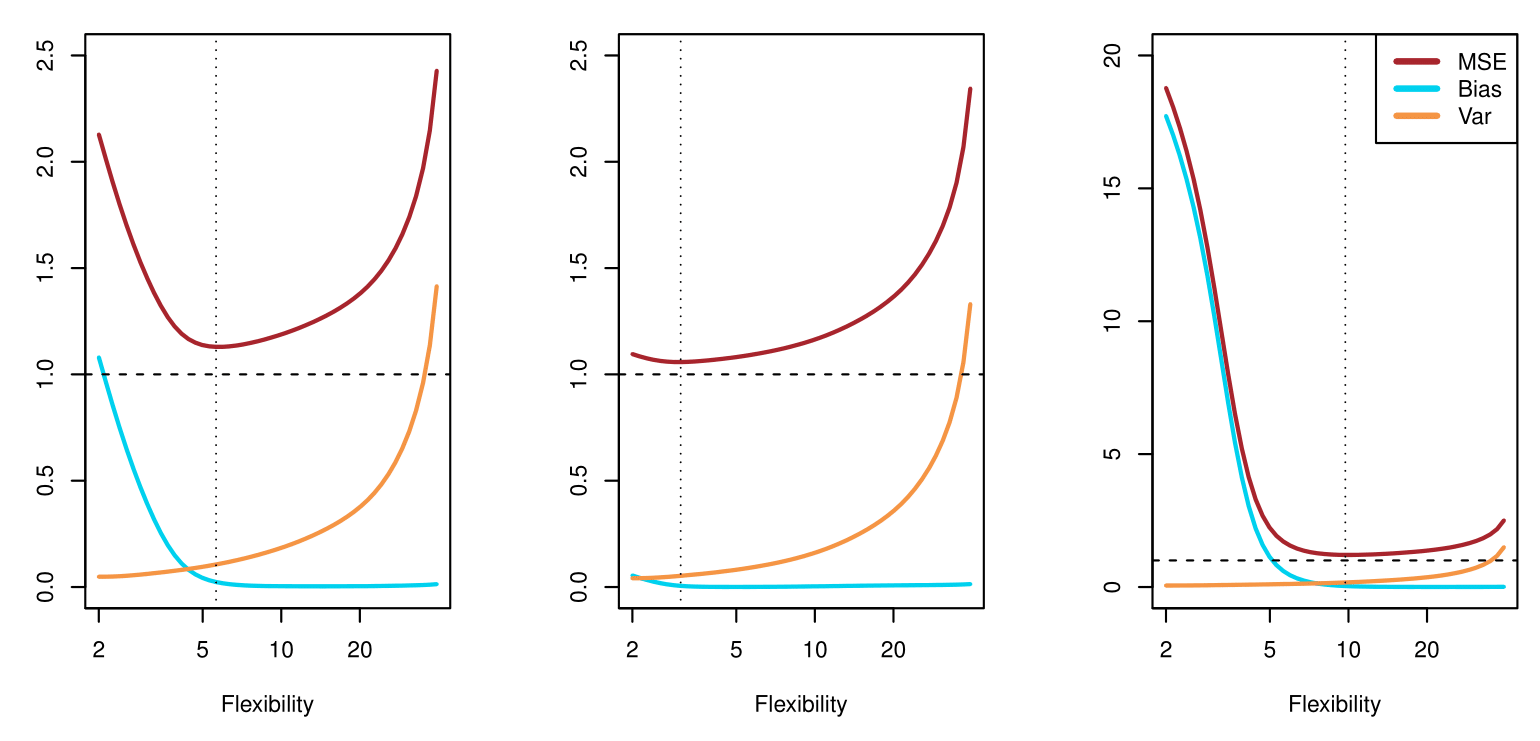
MSE (red curve) goes down initially (as the model becomes more flexible) but eventually goes up (as overfitting sets in).
Bias (blue/teal curve) decreases with increasing flexibility.
Variance (orange curve) increases with increasing flexibility.
The vertical dotted line in each panel suggests a model flexibility that balances both bias and variance in an “optimal” region for minimizing MSE.