MGMT 17300: Data Mining Lab
Bringing It All Together: From Data to Insights to Decisions
August 01, 2024
Overview
Motivation
The Importance of Context
Six General Principals
Choosing the Chart
Less is More
Hierarchy Among Data
Not All Data Are Equally Important
Telling Your Story
Dashboards
Motivation
Motivation
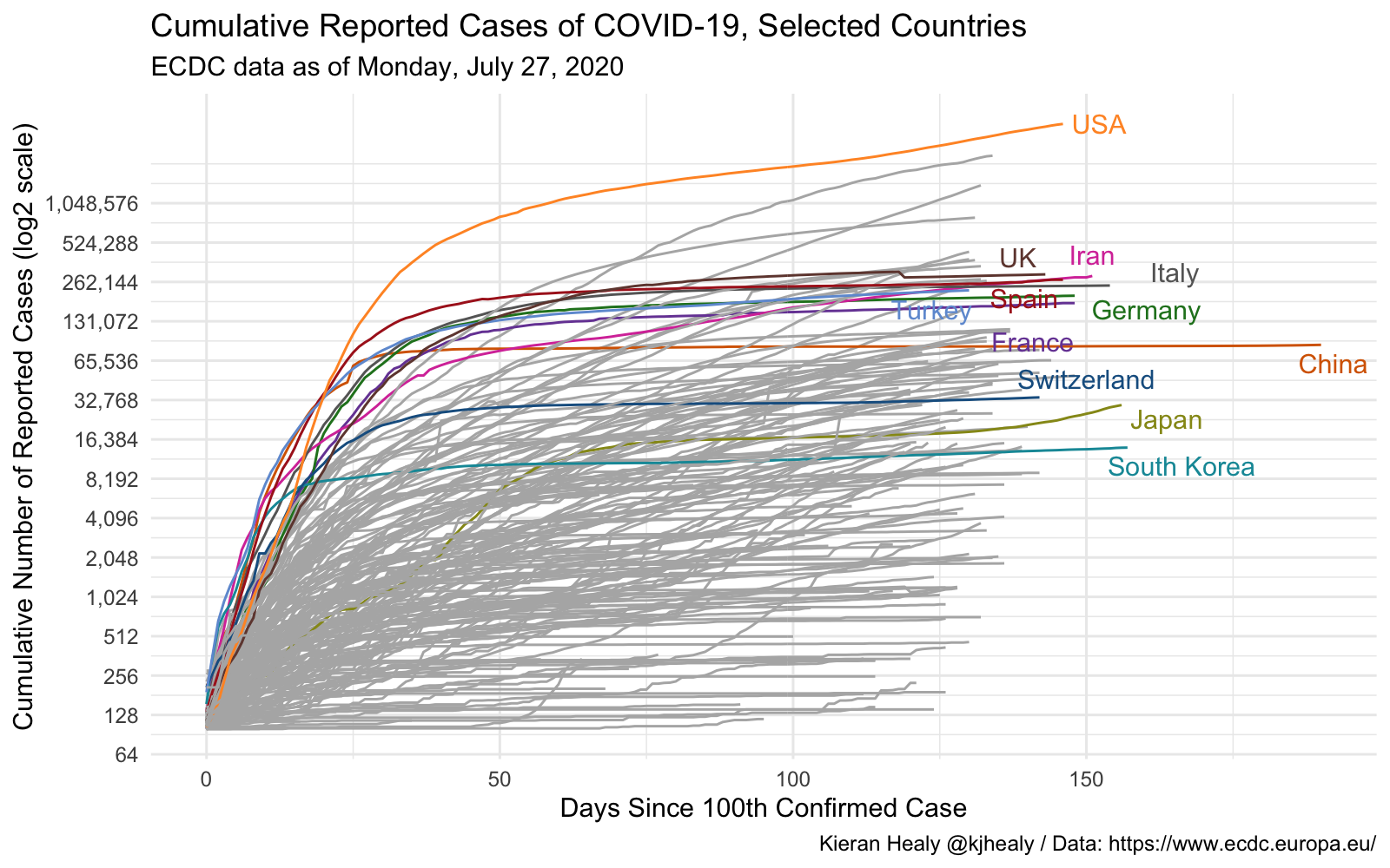
The Forest and the Trees

We have explored many implementation details in recent days, focusing on individual aspects of each analysis.
Today, we want to take a step back to think less about the detail and more about the process.
After all, every data analysis has a purpose. How can we achieve it more effectively?
Essential Elements of Data Communication
Let’s break down the data communication process into six general principles:
- Context matters
- Visualization derives from data
- Separate signal from noise
- Impose hierarchy among data
- Beauty also counts
- Your analysis should tell a story
Context
Context
Every analysis has a goal and an audience.
It’s important to separate data exploration from the final analysis. Don’t fall into the temptation of showing everything you did.
Adapt the report to your audience. Decision-makers aren’t always interested in execution details.
So what? Keep a specific learning objective in mind. It will guide which information is relevant for your report.
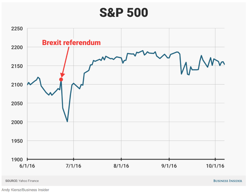
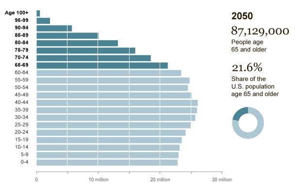
Isolated numbers don’t tell us much. To make evidence-based decisions, it’s necessary to establish an appropriate basis for comparison for the goal of your report.
Context Can Come from New Information…
…or Reinforce Existing Information
Choosing the Chart
Choosing the Chart
What type of data?
How many dimensions?
Most reports are consumed in 2D media. Showing more than that can confuse the reader.
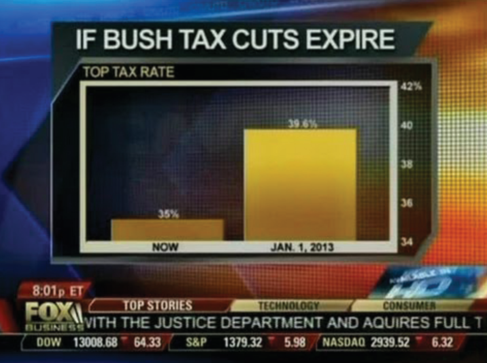
Be careful with scales!
Scales Can Be Misleading
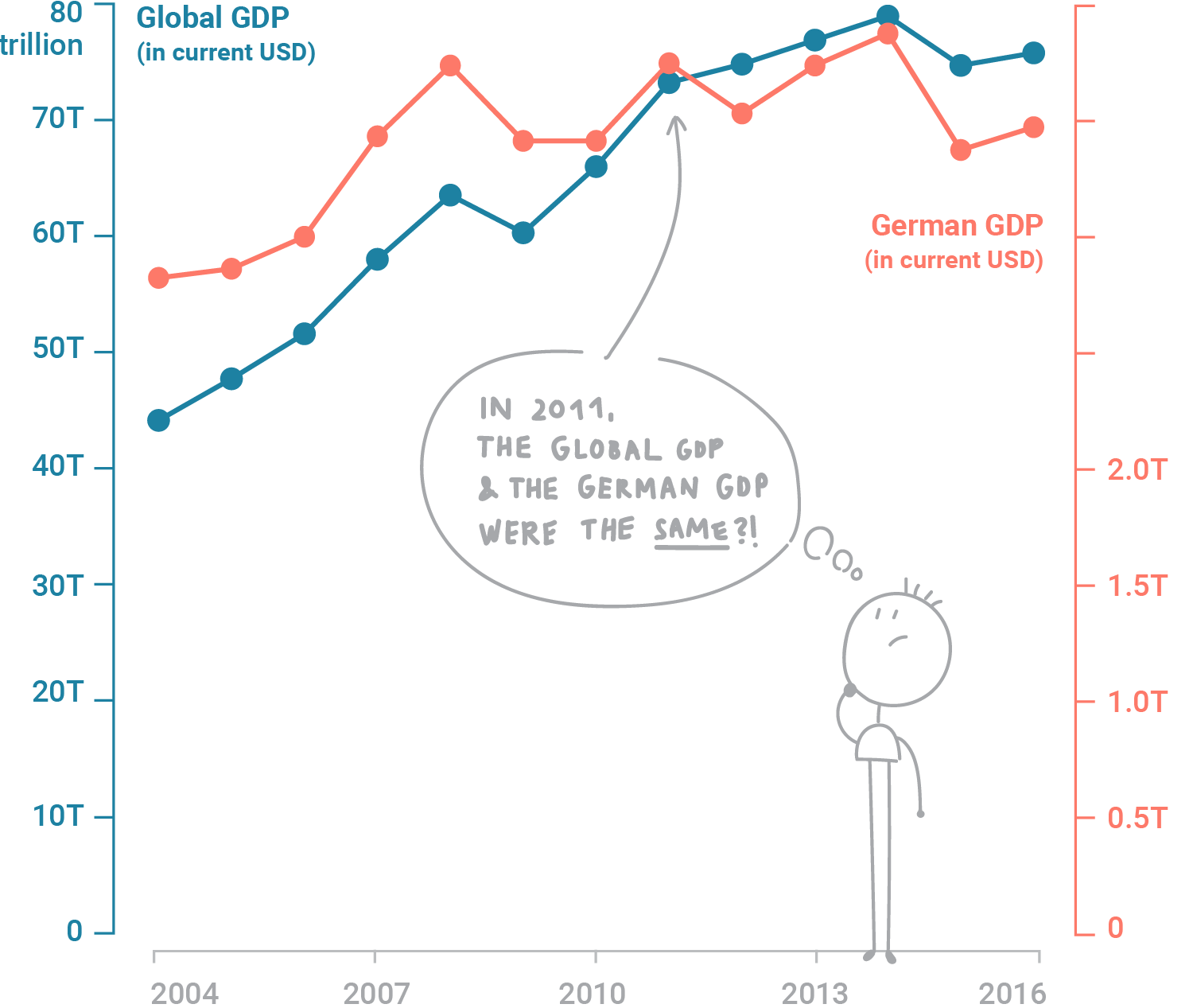
Avoid Dual Axes
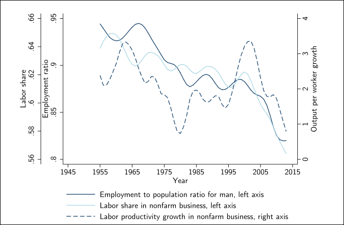
Or Triple Axes!
Fewer Pie Charts…

What?!
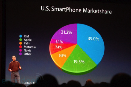
Oof

Less Is More
Eliminating Noise
The more information in your visualization, the greater the cognitive load.
Your objective must be to reduce your audience cognitive costs.
Data-Ink Ratio Formula
\[ \text{Data-Ink Ratio} = \frac{\text{Data-Ink}}{\text{Total ink used to print the graphic}} \]
Data-Ink Ratio
Your objective must be to reduce your audience cognitive costs.
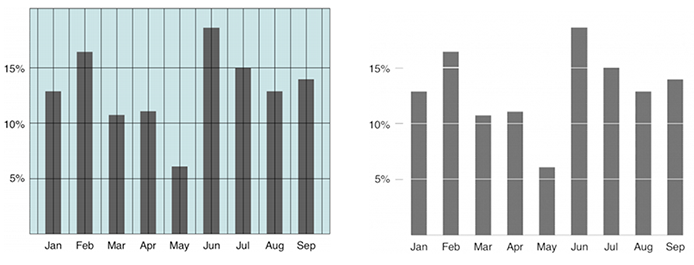
Step-by-Step Cleanup
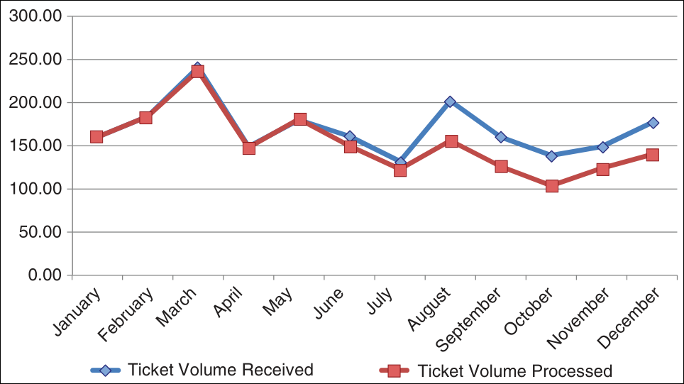
Eliminating the Border
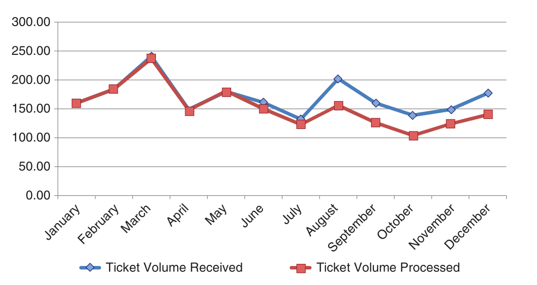
Cleaning the Grids
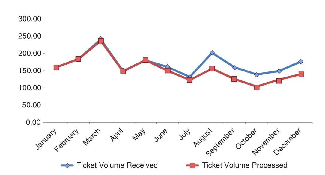
Removing the Points
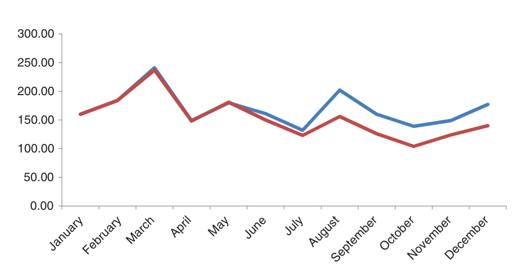
Processing the Axes
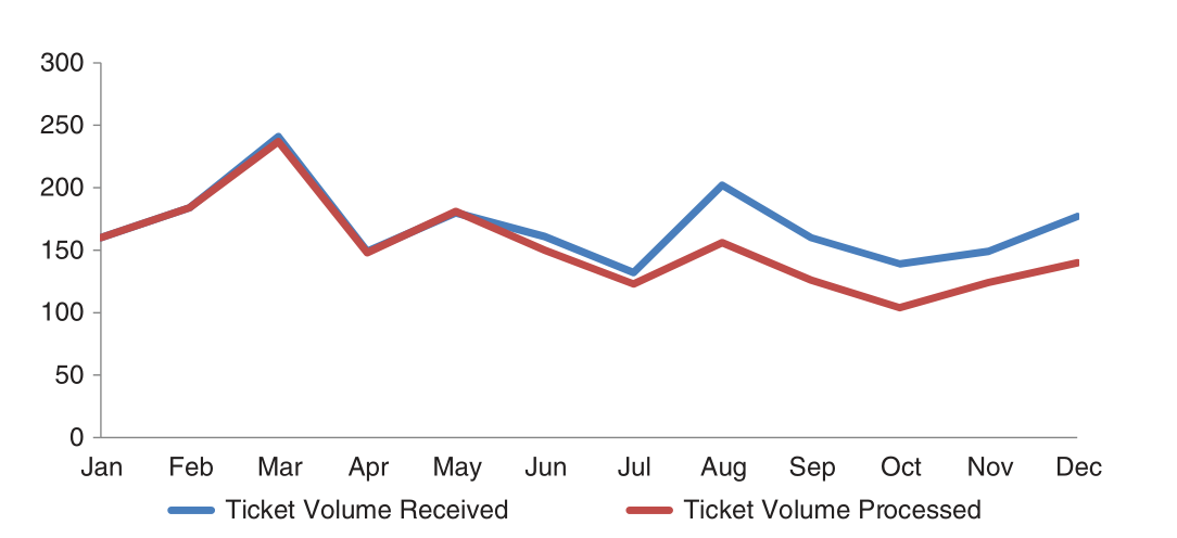
Adjusting the Label
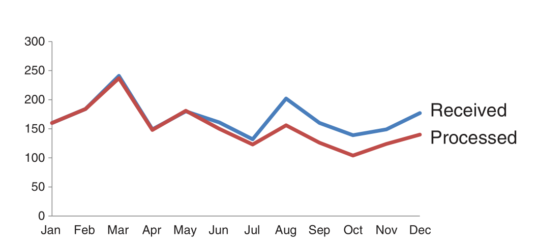
Adjusting Colors
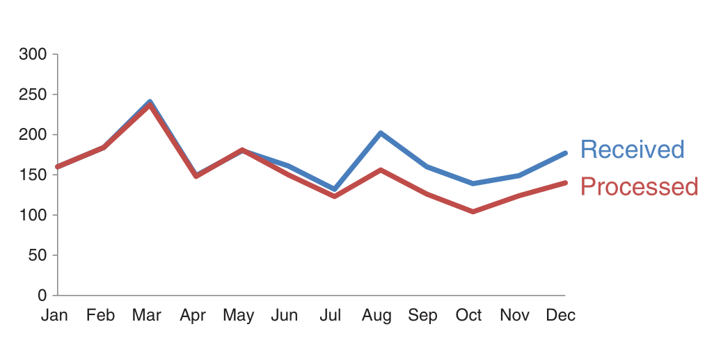
Before and After

Hierarchy Among Data
Count the Number 3s
Count the Number 3s
Ways to Draw Attention
Highlighting with Colors
Returning to Our Example
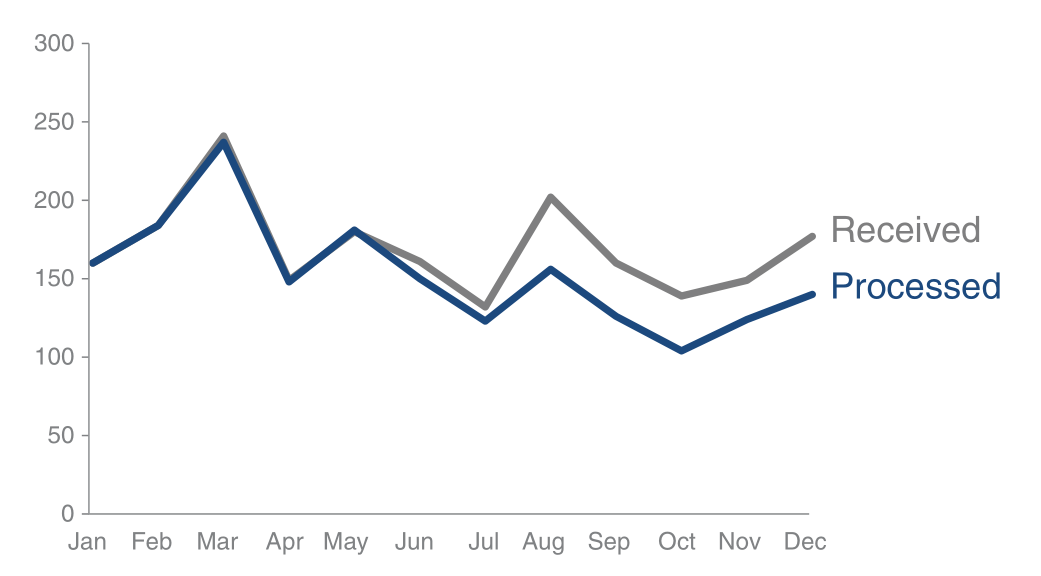
Returning to Our Example
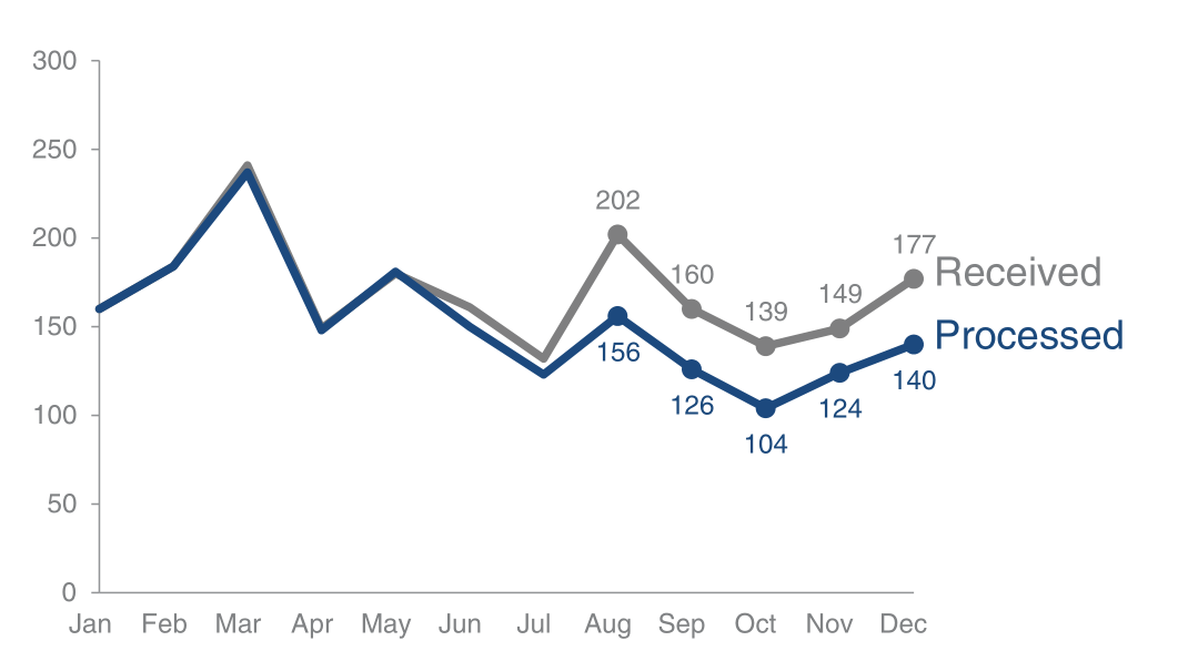
Use Colors Strategically
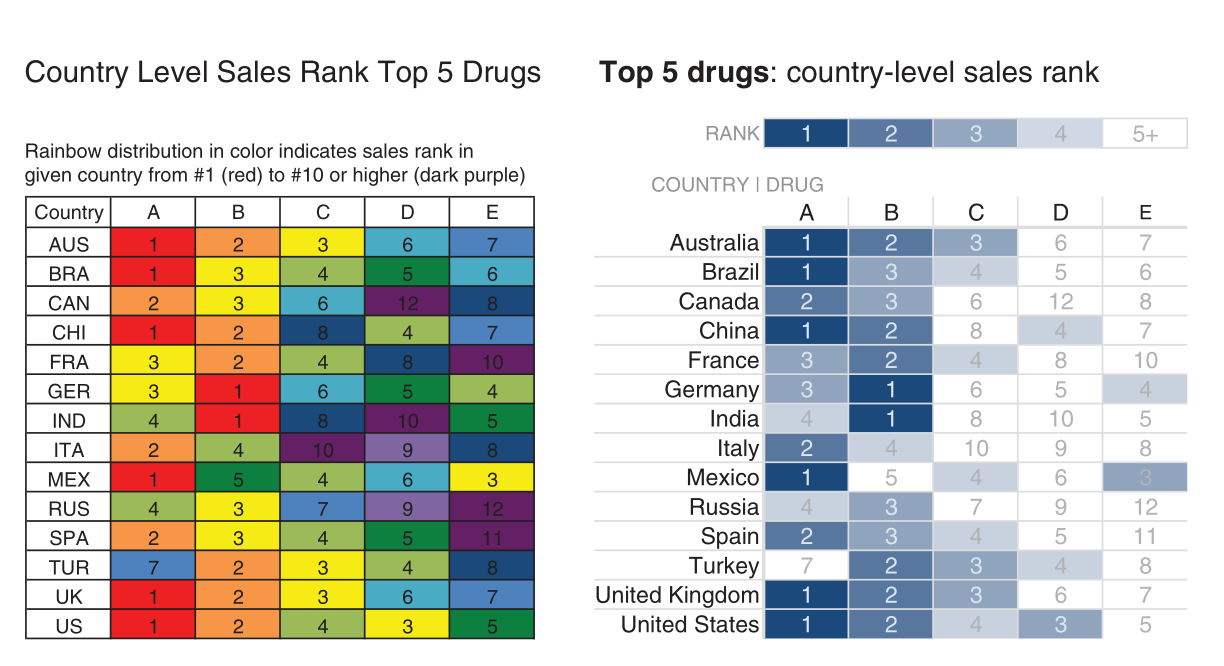
Not All Data Are Equally Important
Emphasizing the Main Point

Emphasizing the Main Point
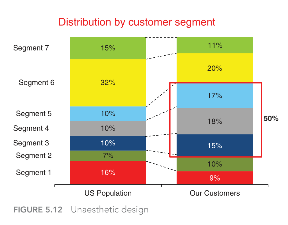
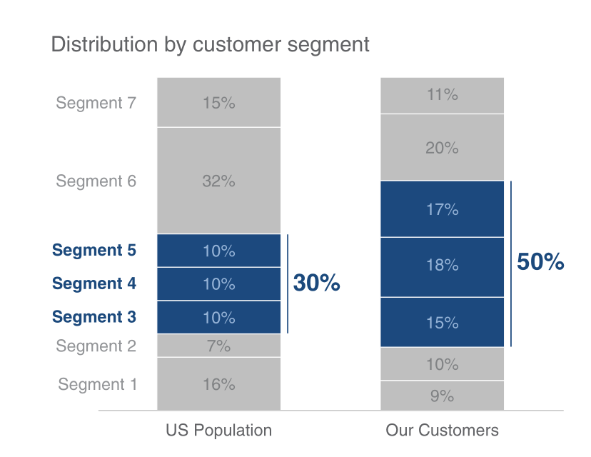
Telling Your Story
Bringing It All Together
Let’s tell a story starting from the chart below, making step-by-step adaptations we’ve discussed. What is it telling you?
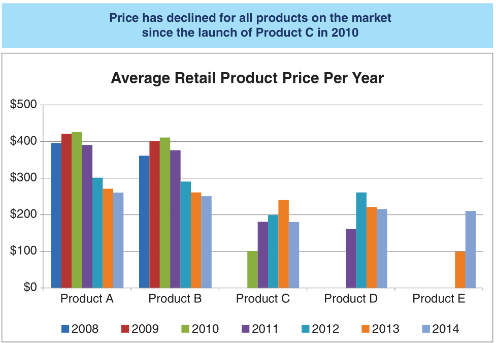
Bringing It All Together
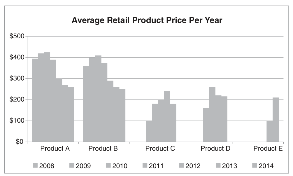
Bringing It All Together
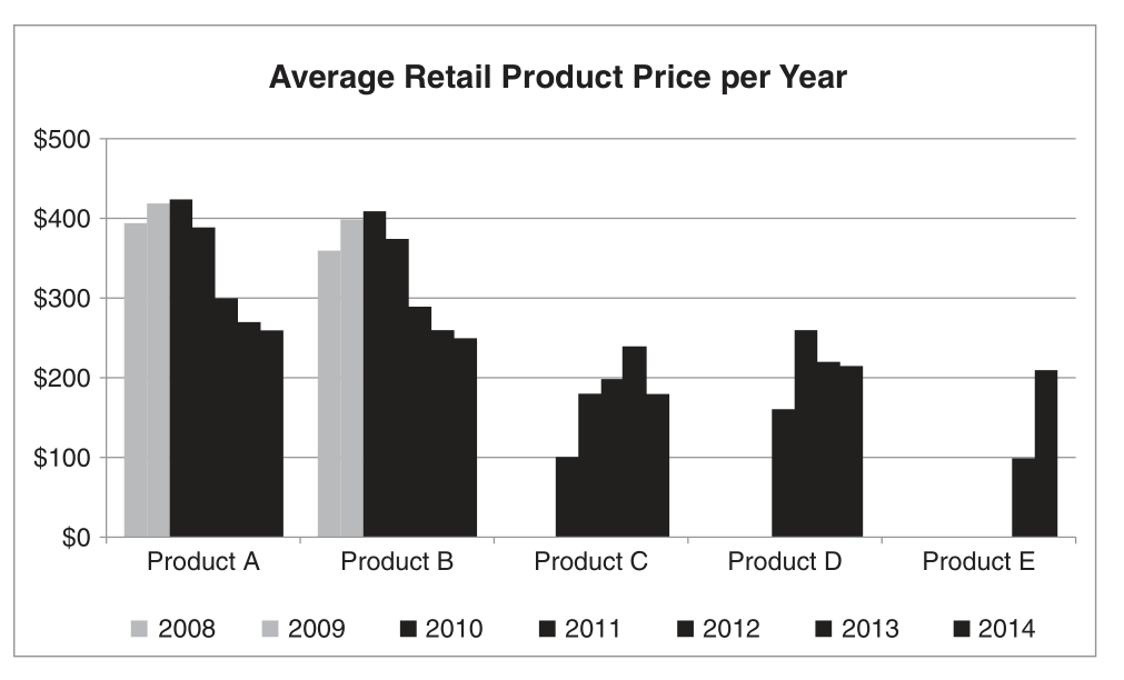
Bringing It All Together
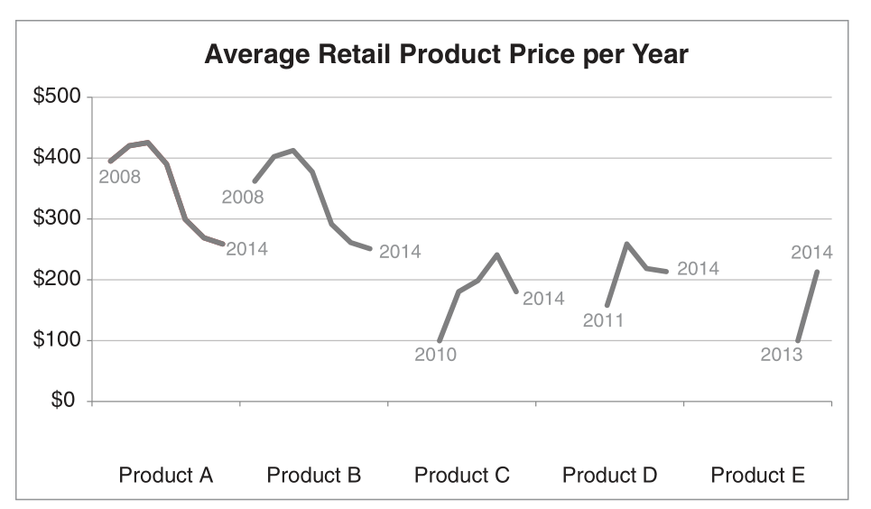
Bringing It All Together
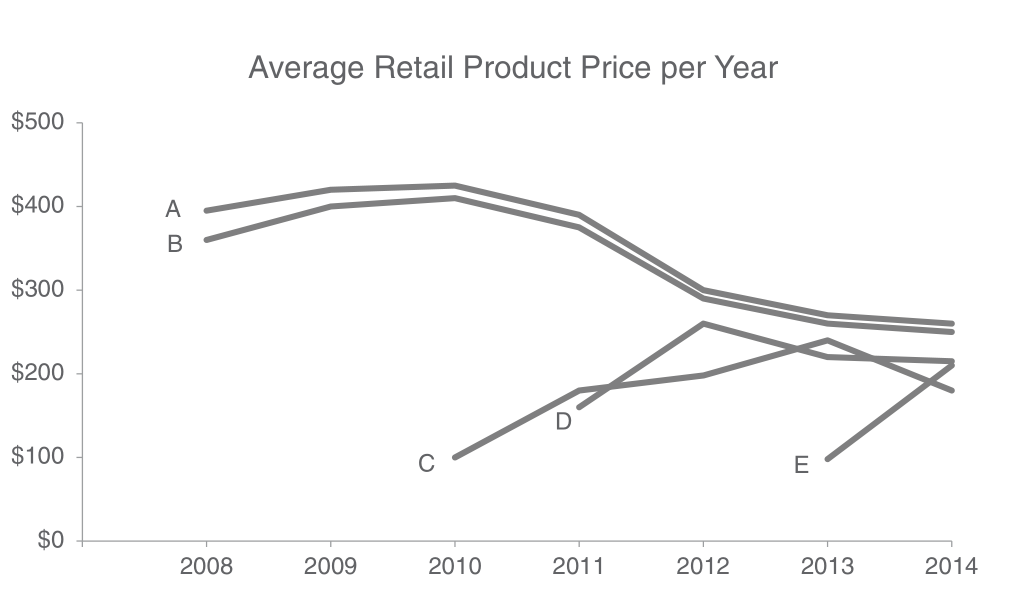
Final Narrative
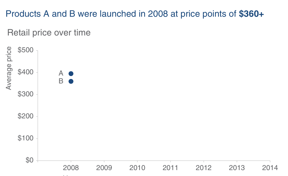
Final Narrative
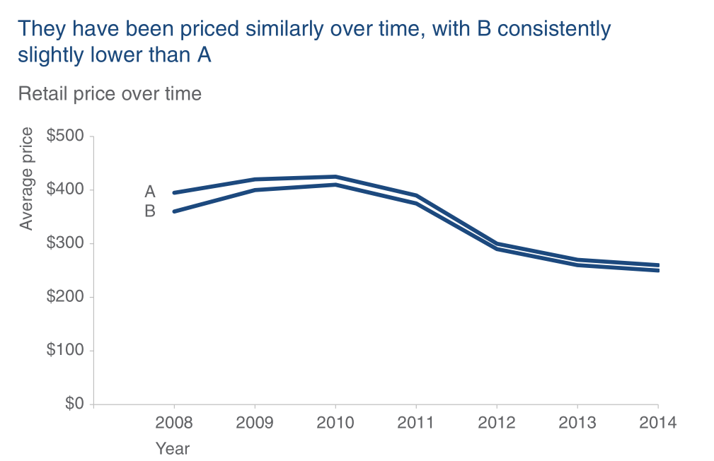
Final Narrative
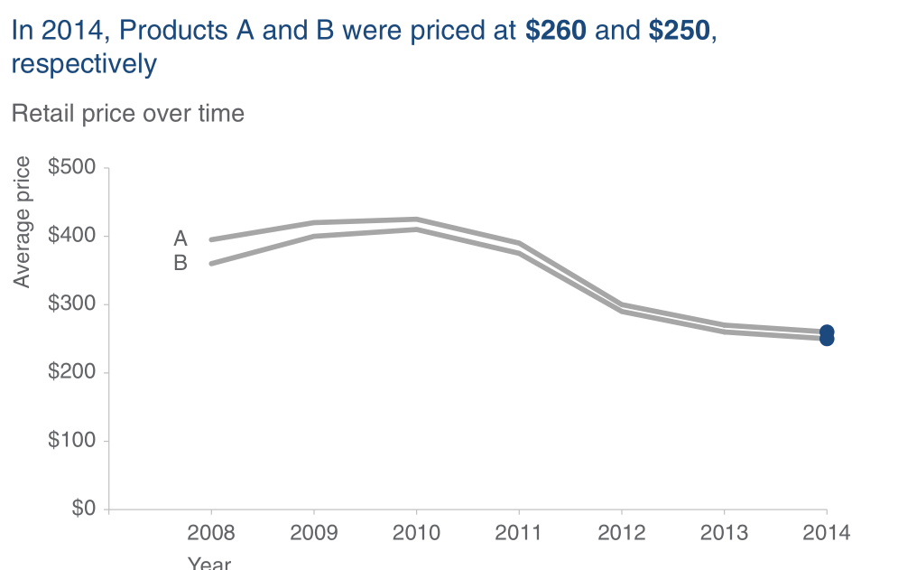
Final Narrative
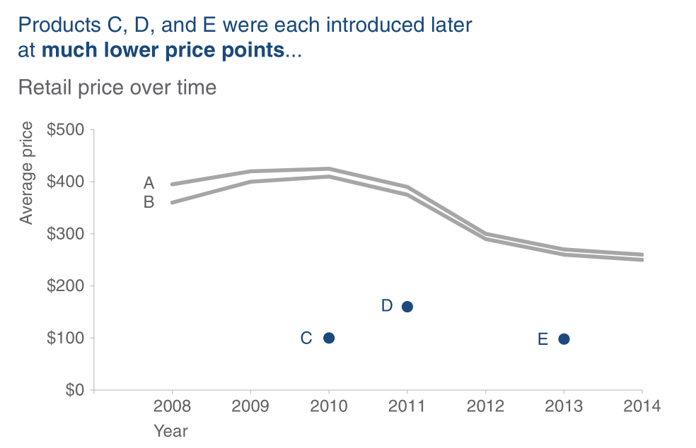
Final Narrative
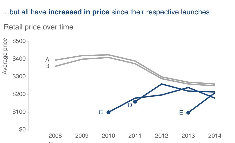
Final Narrative
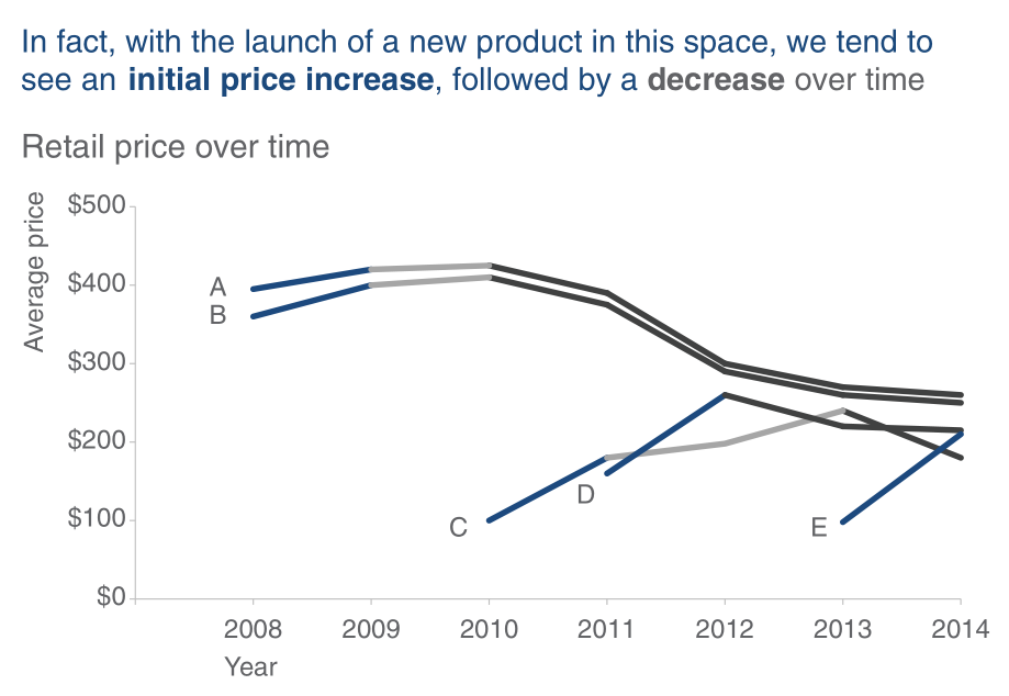
Final Narrative
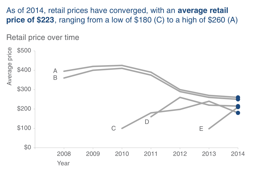
Final Narrative
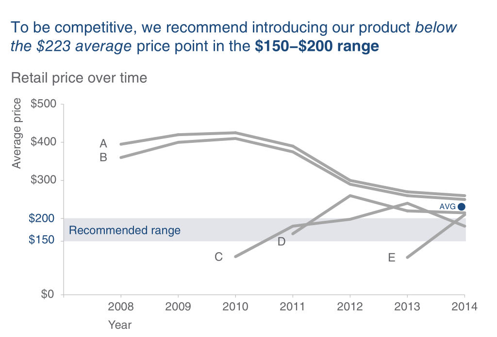
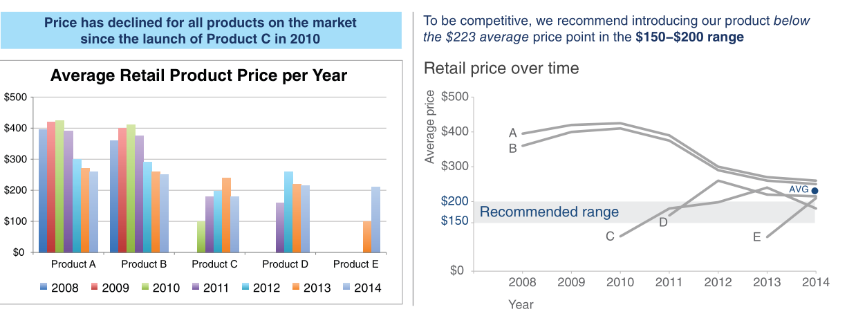
Before and After
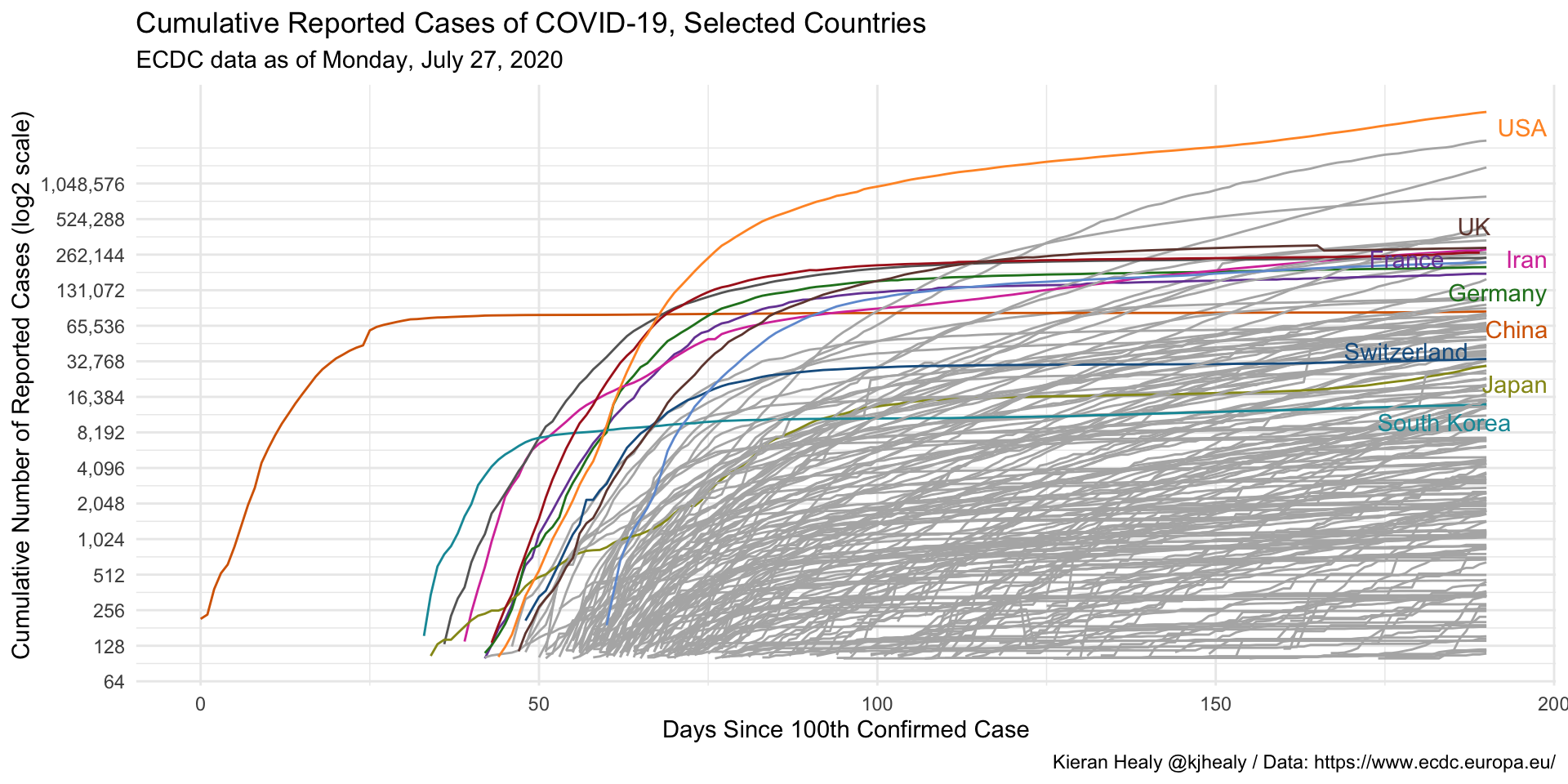
Application: COVID-19 Evolution
COVID-19 Evolution
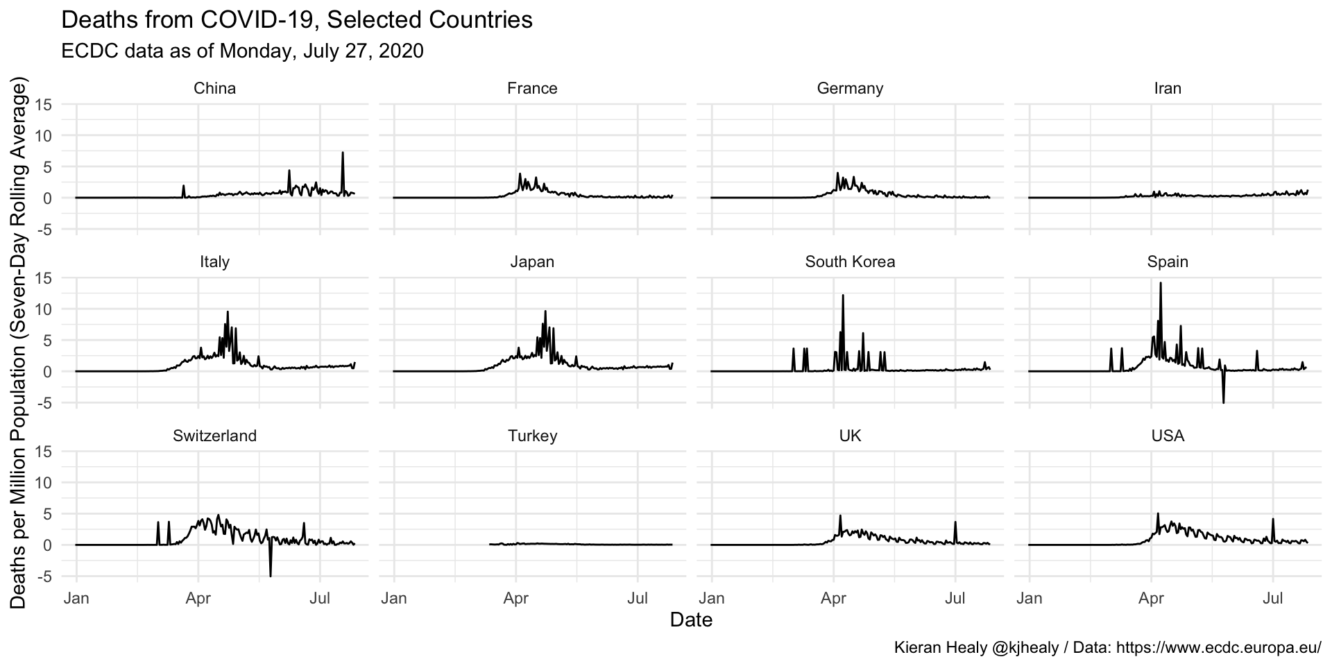
Moving Average
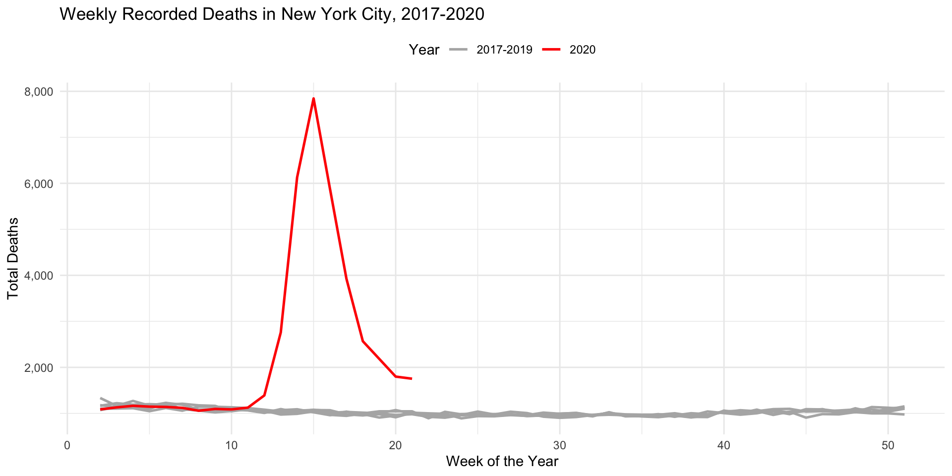
Deaths in New York
Additional Material
Dashboards
Dashboards

The goal of flexdashboard is to facilitate the creation of interactive dashboards with R Markdown.
Flexdashboard: Features
Support for a wide variety of components, including
htmlwidgets; base graphics, structure, and grid; tabular data; gauges and value boxes; and text annotations.Flexible and easy to specify layouts based on rows and columns. Components are intelligently resized to fill the browser and adapted for mobile display.
Storyboard layouts to present sequences of visualizations and related commentary.
Flexdashboard: Installation and Use
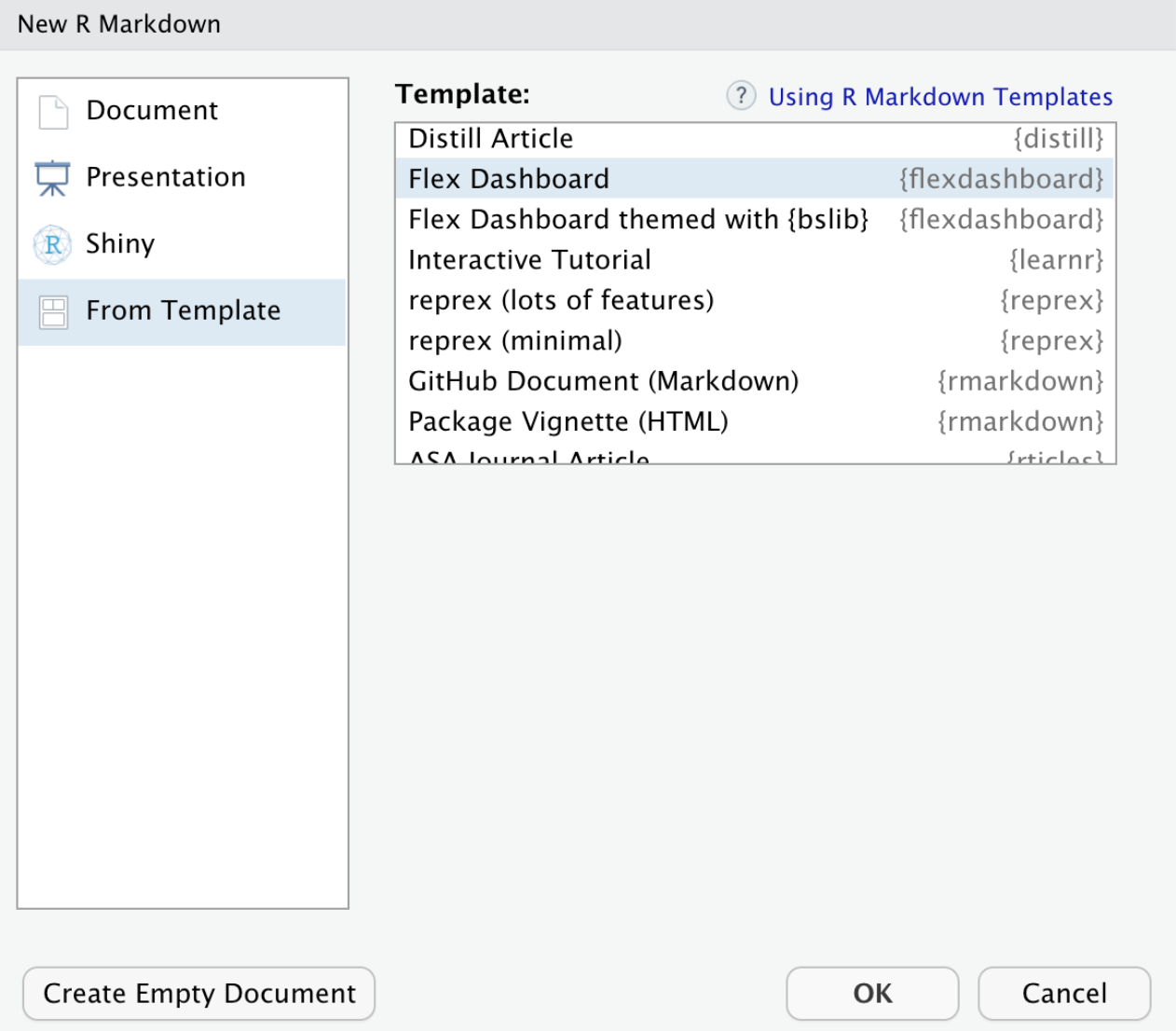
After installing the package, to create a flexdashboard simply open a new R Markdown document with the output format flexdashboard::flex_dashboard. You can do this from within RStudio using: File > New File > R Markdown...:
Flexdashboard: Layout
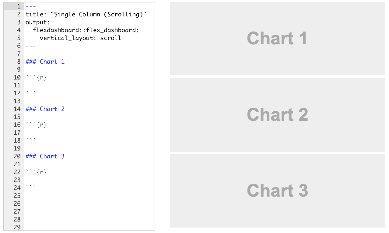
Dashboards are divided into columns and rows, with output components delineated using level 3
markdownheaders (###).By default, dashboards are laid out in a single column, with charts stacked vertically and sized to fill the available height of the browser.
Flexdashboard: Layout

Depending on the nature of your dashboard (number of components, ideal component height, etc.), you might prefer a scrolling layout where components occupy their natural height and the browser scrolls when additional vertical space is needed.
You can specify this attribute via the
vertical_layout: scrolloption.
Flexdashboard: Layout
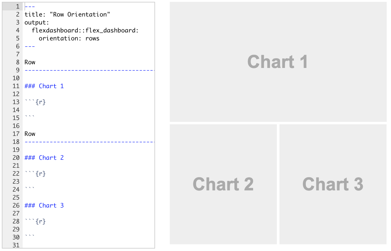
- You can also choose to orient the dashboards by row instead of by column by specifying
orientation: rows.
Flexdashboard: Storyboard

Storyboards are an alternative to the row and column-based layout schemes.
They are suitable for presenting a sequence of data visualizations and related commentary.
To create a storyboard layout, add
storyboard: trueto the dashboard’s preamble. This option includes a set of level 3 dashboard components (###). Each component will receive its own frame in the storyboard, with the section title used as a navigation caption.
Dashboard: Additional Material
Summary
Summary
Main Takeaways from this lecture:
Data Communication Principles:
- Context matters: Tailor your analysis to the audience and goal.
- Focus on the story: Highlight insights, not the process.
- Beauty and clarity: Simplify visuals, use appropriate colors, and remove unnecessary elements.
Visualization Best Practices:
- Use graphs instead of tables where possible.
- Avoid misleading scales and excessive dimensions.
- Prioritize hierarchy and emphasize key data points.
Effective Dashboards:
- Utilize tools like
flexdashboardto create interactive layouts. - Structure information logically, adapting to mobile and web use.
- Storyboard layouts help narrate data insights step-by-step.
- Utilize tools like
Final Message:
- Less is more. Reduce complexity to communicate data effectively.
- Always keep your audience’s decision-making needs at the forefront.
Thank you!
Data Mining Lab